
10 Proven techniques for Product Photography Composition | Omi.so

Written by
Miranda Gabbott
Aug 22, 2025
Table of contents
10 Proven techniques for Product Photography Composition | Omi.so
When a product photo works, you don’t think about why — you just want to click ‘buy now.’ But behind every conversion-driving product image is a set of compositional decisions that help communicate the product’s value.
Whether you're creating product imagery for a landing page header, scroll-stopping visuals for paid ads, or PLP photos for catalog-style scanning, the composition of your image shapes how effectively it sells your product.
In this guide, we’ll break down 10 must-know composition rules that inform your product photography strategy. You’ll learn how to deliver creative product photography that’s both beautiful and strategic, whether you’re briefing a product photographer, or using a tool like Omi to create product shots yourself with Digital Twin technology.

Confidence in your product photography composition opens many doors for creative exploration, and performance, in your marketing.
Experiment with an unlimited number of product photo compositions
1. The best composition depends on the context of the image
The composition of your product photo will depend on what you need the image for. In some cases, the layout will be prescribed for you by a platform, no design theory required!

Medik8 went for a creative group packshot to set the stage for the newsletter in the header. Then, simpler flat lay shots of the featured products offered a more detailed demo-type visual display for conversions.
To take a few examples:
Amazon product photography (at least the first image) should be shot on a white background, with 85% of the image taken up by your product.
Social ads require an eyecatching composition to stop users from scrolling. You can experiment with composition considerably: think exciting props and curious angles.
Email banners often need considerable negative space for headline text, CTAs, and logos.
Product Detail Pages (PDPs) will need multiple clean, zoomable packshot photos from a variety of angles angles.
2. Plan for the final aspect ratio(s)
Communicate the final aspect ratio, size, and intended use of your images before the shoot. All too often, marketers crop images for unforeseen use cases, ruining the original composition and compromising the images’ performance.

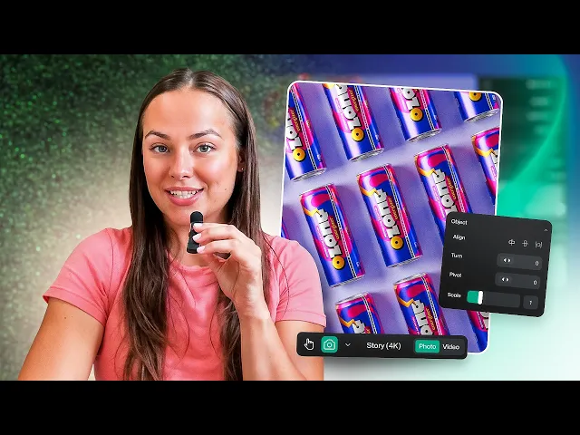
Look at the Instagram Story image to the right. Endro left negative space (that is, unused space) above the product when they composed the scene in order to add text and interface there. Without this consideration in advance, they might have ended up with awkward cropping to fit these in later.
Different aspect ratios demand different framing strategies, for example:
Square formats, such as for a tiled image on a PLP, works best with centered compositions.
Vertical crops, such as those for Instagram Stories, need more visual balance from top to bottom.
If you don’t plan for these ratios in advance, you risk losing key visual information, distorting product proportions, or weakening the image’s ability to capture attention (and ultimately, to convert).
💡 Pro tip: Product photography costs add up, so it’s understandable to want to repurpose as many images as possible. Commissioning images with the final aspect ratios in mind is a good idea in theory. In practice, you might need images for unforeseen use cases. Here’s one solution: switch from traditional product photography to a Virtual Product Photography tool like Omi. With Omi, you get access to a Virtual Photo Studio — an intuitive editor where you can have an unlimited amount of photoshoots, using a 3D model (or Digital Twin) of your product. You can easily “reshoot” your product images with different compositions, sizes, and aspect ratios — no cropping needed. You can turn an Instagram Story into a website banner… or even a billboard image.
 The team at Misencil knows that lifestyle images often have a more cinematic feel, and therefore went with a Landscape composition. |
3. Play with balance by considering visual weight
In photography, visual weight refers to how much attention an element commands in an image. “Heavier” elements like dark colors, bold textures, and large objects draw the eye in.

Fauchon, Clarins, and Panier des Sens make use of unstable compositions here for a dreamy, immersive look.

Fauchon, Clarins, and Panier des Sens apply stable compositions for a grounded look that instills trust, clarity, and confidence.
Bottom-heavy images feel more grounded and natural since that’s how we experience the world. Just think of landscapes or sunsets, with the solid earth in the bottom third of the image and the sky above it.
Conversely, top-heavy photos feel unstable; as though they might tip over.
Given that, experiment with:
“Unstable” top-heavy images for visuals that need to be unexpected in order to grab attention, like ads and social media posts.
“Stable” bottom-heavy images for visuals for PDPs and Amazon listings, where the aim is to convey trust and clarity.
💡 Pro tip: with Omi, you can experiment with “top heavy” visuals by creating product images and videos that defy gravity. Think: cosmetics balanced at impossible angles, or wine bottles rotating weightlessly. With Virtual Photography you can create videos that would otherwise require an entire special effects team to create — and execute compositions that traditional photography would never allow. When they launched their new age-defying serum, Esthederm turned their still images compositions into video, significantly expanding their arsenal of assets, and extending their campaign. |
4. Use the rule of thirds to create harmony
The rule of thirds is one of the most famous and reliable techniques in design theory. It lends images a good mix of balance and dynamism, creating pictures that have a sense of movement but still feel intentional.

Example of the ‘rule of thirds’ applied by Endro to create a sense of harmony. This would not have been achieved with a centered design, which tends to feel confrontational (more often applied to direct conversion visuals).
Simply divide your image into nine equal parts using two horizontal and two vertical lines — and place key elements along those lines or at their intersections (sometimes called ‘power points’ or ‘strengths’).
The rule of thirds is an effective compositional technique for PDP images, where the focus is on clearly communicating details about a product, rather than capturing a buyer’s attention.
For example, let’s say you’re working in the high tech electronics industry and shooting a pair of headphones. You might line up the edge of your headphones with one vertical line, and the floor beneath the headphone with one horizontal line. Easy!
5. Use diagonals to create dynamic images for ads and socials
Diagonal composition is an attention-grabbing technique that’s great for ads and social media posts, where the goal is to stop users in their tracks.

As its name suggests, this strategy involves placing compositional elements along a diagonal axis, rather than sticking to the horizontal or vertical grid. Diagonal layouts introduce a subtle sense of motion and energy.
Top left to bottom right diagonal compositions follow how people read a page (if they’re used to reading alphabets like Latin or Greek, that is). This feels dynamic but natural to look at.
Bottom left to top right diagonal compositions feel more challenging and impactful — a climb instead of a slide. This angle lends power to an image.
💡 Pro tip: if you’re using Omi, it’s easy to create an energetic image with parallel rows of your product, tiled diagonally. The format is a real show-stopper for ads, flyers, and social media images. Check out this tutorial to learn how: |
6. Use a triangle composition to balance movement and calm
Triangle layouts are a go-to for structured yet dynamic product shots. Arranging the props and products in a triangle shape creates visually engaging images that feel both lively and polished.

The diagonal lines of triangles add movement, while their bottom-heavy shape creates a sense of balance.
For example, let’s say you’re photographing a skincare trio for an ad: a cleanser, toner, and moisturizer. Place the cleanser and toner side by side at the base, and elevate the moisturizer (your hero product) slightly above, forming a triangle.
This draws the eye upward to the most important item, and creates a sense of cohesion without appearing too static.
Experiment with triangles, depth, thirds, and more with Virtual Photography
The sky's the limit. Omi's 'Digital Twins'-based Virtual Studio lets you create high-performing product imagery on-demand.
7. Use the rule of odds to create engaging images
The ‘rule of odds’ states that odd numbers of subjects make compositions appear more dynamic. When styling your scene with products or props, opt for three or five elements instead of two or four. It’s a simple trick to add visual interest.

Not unlike the ‘rule of thirds’ the ‘rule of odds’ creates a dynamic and soothing feeling. The human brain is drawn to asymmetric visual compositions. In this image, Daan Tech used Omi's Virtual Studio to create the dynamic design.
This layout would work especially well on category landing pages, where you need to draw attention to a group of products. For example, if designing image composition for a landing page of summer-themed candles, instead of placing two candles side by side, try arranging five at different heights.
This feels more organic and encourages the viewer’s eye to move around the frame, which is likely to improve time-on-page.
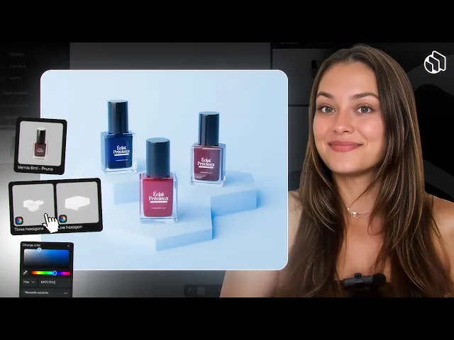
8. Experiment with the fibonacci spiral for fine-art level harmony
You may have heard of the golden triangle or fibonacci spiral. As a compositional technique, the idea is to lead the viewer’s eye through the frame in a gentle curve, starting with the focal point and moving outwards in a spiral.

Placing your product in the apex of the Fibonacci spiral draws the eye. In this case, Peggy Sage used the remaining negative space for supporting text.
You don’t need to follow the spiral literally, but using it as a framework helps you position your product in a way that feels intuitive and aesthetically pleasing.
For instance, if you’re creating a hero image for a landing page, place the product at the center of the spiral and arrange props or shadows along the curve.
This kind of guided visual flow encourages customers to focus on key product features and increases the chance they’ll stay engaged longer, which often correlates with improved dwell time.
9. Add levels to create a sense of depth and scale
Product images with only one plane of information can feel lifeless. Instead, you should aim to communicate depth — as though the action of the image continues outside of the compositional frame.

Lifestyle images like these typically apply depth compositions. Works well for social media, branding, and to complement the flat conversion product imagery on your PDPs.
To do this, introduce multiple levels into your composition: foreground, midground, and background. This could mean placing your product on a podium, behind a prop, or against a background that reflects its real-world use.
It’s particularly important to add depth to PDP images. Levels anchor the product in space, offering an important scale reference that helps customers understand what they’d receive if they click “Buy now”. It might reassure them: “yes, that bottle will fit in my bag,” or “that candle is a good size for my coffee table.”
💡 Pro tip: a classic way to create depth in product photography is to set your product on a podium. There are dozens of them in Omi’s Virtual Photo Studio (along with 6.000+ other objects). This certainly beats ordering a bunch of styrofoam podiums on Amazon. |
10. Remember these principles apply to video
Product videos have been shown to dramatically increase conversion rates. If you’re not creating them for your hero products, take this as your sign to start.
This sample of product videos (created with Omi's Virtual Studio) demonstrates many design principles we've covered: visual weight, diagonal design, depth, context, and format considerations.
For non-narrative videos that simply aim to show off your product in a livelier way, these same compositional principles carry over.
Whether you’re planning a rotating 3D shot or a 10-second social ad, the rule of odds, triangle compositions, and considering visual weight can all help ensure your video looks polished and professional.
Nailing your product image composition will boost your conversions
Product photography composition is about highlighting which visual information you want your buyers to notice. Clean, straightforward compositions are essential for product listing pages (PLPs) and detail pages (PDPs), and creative compositions elevate your imagery for marketing, social media, and branded campaigns.
Fail to consider composition from the beginning, and you may find yourself uttering those little words all designers hate: “let’s fix it in post”. Relying on editing to fix initial errors often costs more time and reduces image quality.
The end result? Content projects that go way over budget.
The good news is that you no longer need to have a master plan from the beginning to create images with suitable compositions. With Omi, composition becomes part of the creative process the whole way through — not a post-production issue — helping you create visuals that are beautiful, intentional, and built to convert.
Experiment with an unlimited range of product photo compositions
About the author
Miranda Gabbott
-
Technical Writer, 3D Product Visualization
Miranda Gabbot.


