12 Ways to Improve eCommerce Product Image Conversion
According to an MIT study, the human brain processes images in just 13 milliseconds. Customers who land on your eCommerce site, therefore, see your product images and pass judgement almost instantly.
If your product imagery doesn’t say all it needs to say in a fraction of a heartbeat, you’re in the right place.
This article is a detailed rundown of the best practices around eCommerce product images, drawing on customer data, neuroscience, and advice from leading platforms. We’ll focus mostly on the product detail page (PDP), but will also touch on product listing pages (PLPs) and hero images (which in an eCommerce context, are often packshot photos).
Read on to learn how to ensure your eCommerce imagery is working as hard as possible for your conversion goals.
How many photos should be on each product detail page (PDP)?
The number of photos you need to include on a PDP depends on how complex your product is, and how much of a financial commitment it represents for your customers.
For simple and inexpensive products, like food and cosmetics, between 3 and 5 images is plenty. This is industry standard — Amazon recommends users show 6 images on a product listing.
For fashion and accessories, aim for 5 to 8 images, so customers can get an idea of fit (ideally on a couple of different body types) standout details, and textures.
For items that are complex and/or expensive, such as furniture and electronics, you should include 6 to 10 images. Include images that show details, scale, and materials, as well as any technical or physical considerations (such as charging ports for electronics, or construction details for furniture).
The idea is to provide enough detail for users to get a complete picture of what your product looks like, so they can feel confident to make a buying decision.
It’s also wise to add a product video, 3D Viewer, or 360° photo to PDPs of your leading products.
With Omi Video, you create videos in mere minutes to improve the performance of your PDPs and socials. No need for specialist equipment, studio rentals, expertise, or post-production.
All three types of product visuals give users a clearer idea of what they’re buying, which has been shown to improve a number of key eCommerce metrics: product videos increase conversion rates, and 3D viewers have been shown to knock return rates down by 25%.
12 Best practices for product images
Here’s 12 pieces of advice for approaching eCommerce image creation, to help ensure your images are contributing as much as possible to your crucial metrics.
PDP images
PDP images are the all-important illustrations that go on your product detail pages. Often in carousel form, they contain persuasive visual information about what your product looks like and does. Here’s how to approach creating them.
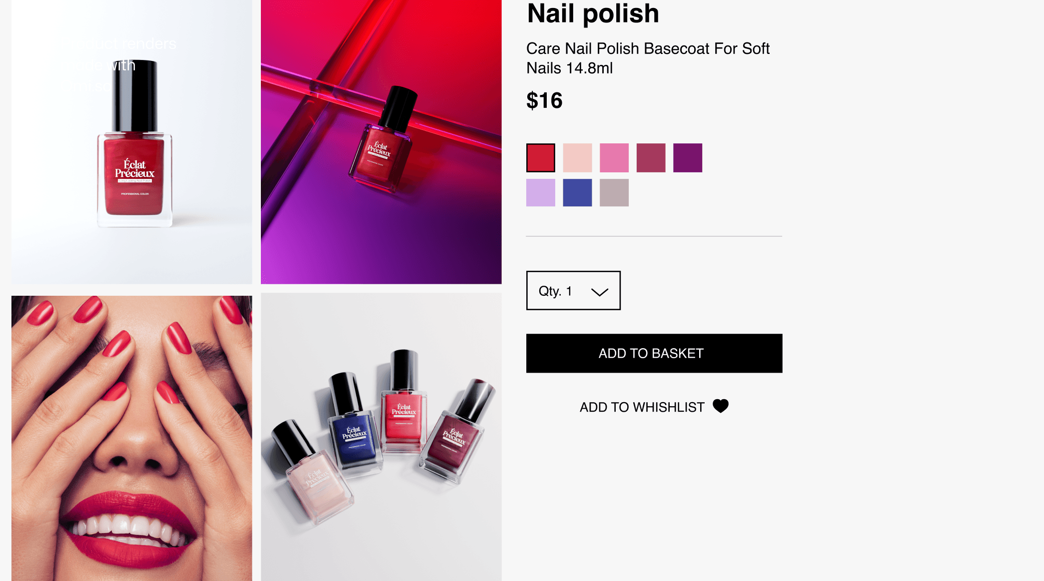
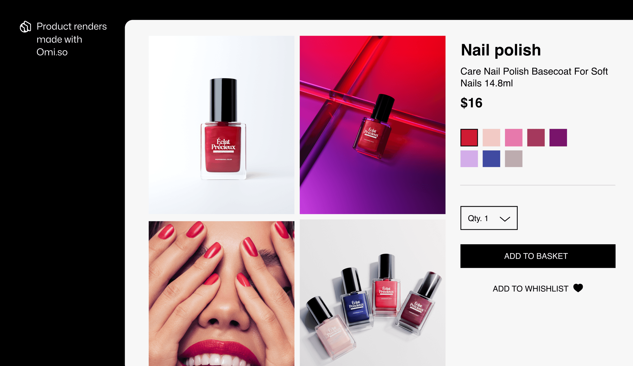
1. Keep the main image simple to boost trust
The first image on your PDP should be simple: the product, head-on, against a plain backdrop. White background photography is an industry best practice for this.
Amazon even mandates that the ‘main image’ in every product listing must have a pure white background, with the product taking up >85% of the image.

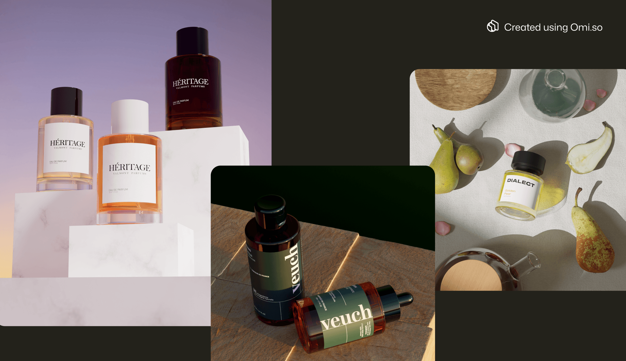
Brands like Endro, Veuch, and Dialect Fragrances use Omi to create simple, elegant product shots for their PDPs, which help customers understand exactly what they are offering.
Sure, you should experiment with creative product photography in ads and further along in a PDP’s image carousel. But you there's no reason to over-engineer the main image on a product’s page.
Why? Because users appreciate clarity. An unambiguous, professional first product shot shows that you are a trustworthy seller, whose product is worthy of attention without any window-dressing.
2. Show every angle and version that could inform someone’s buying decision
As with so much of marketing, the best way to approach creating product images is to think like a buyer. Brainstorm all possible types of photos that might answer a customer’s questions about your product.
Someone purchasing, for example, a hiking rucksack, might want to see photos of:
The fit: someone wearing the rucksack, to show how weight is distributed and how comfortable the straps look
The scale: how big the rucksack is, in comparison to the size of an average person hiking and/or to a hand
The available variations: how the bag’s details change in different colorways or sizes
The zips, fastenings, and linings: to see how durable the materials look
The rucksack empty vs full: to give some impression of its structure, and how heavy it would be
A well-considered carousel of product images is a good substitute for letting a customer handle your products in the flesh at a brick-and-mortar store, offering all the information that goes into a confident purchase experience.
With Omi’s Virtual Photo Studio, you can shoot your product from every possible angle to really flesh out your PDPs... without bloating your budget on studio time. And yes, this 360 video was made using Omi Video.
💡 Pro tip: not sure exactly which product details your customers would need to see images of? A smart alternative is to integrate an interactive 3D viewer onto your product page instead. These allow users to zoom into every detail and surface of your product, and even spin it on its axis. They put customers in the driving seat, allowing them to inspect your product from any angle they wish. 3D viewers have been shown to boost conversion rates by 20%. With Omi, creating a 3D view of your product is simple. Just mail us your product, and our 3D artists will turn it into a photorealistic Digital Twin. You can use this to create 3D views with our intuitive builder. They’re easy to set up on your site since Omi’s API integrates with major CMS platforms — and they won’t slow down your page speed. What’s not to like? |
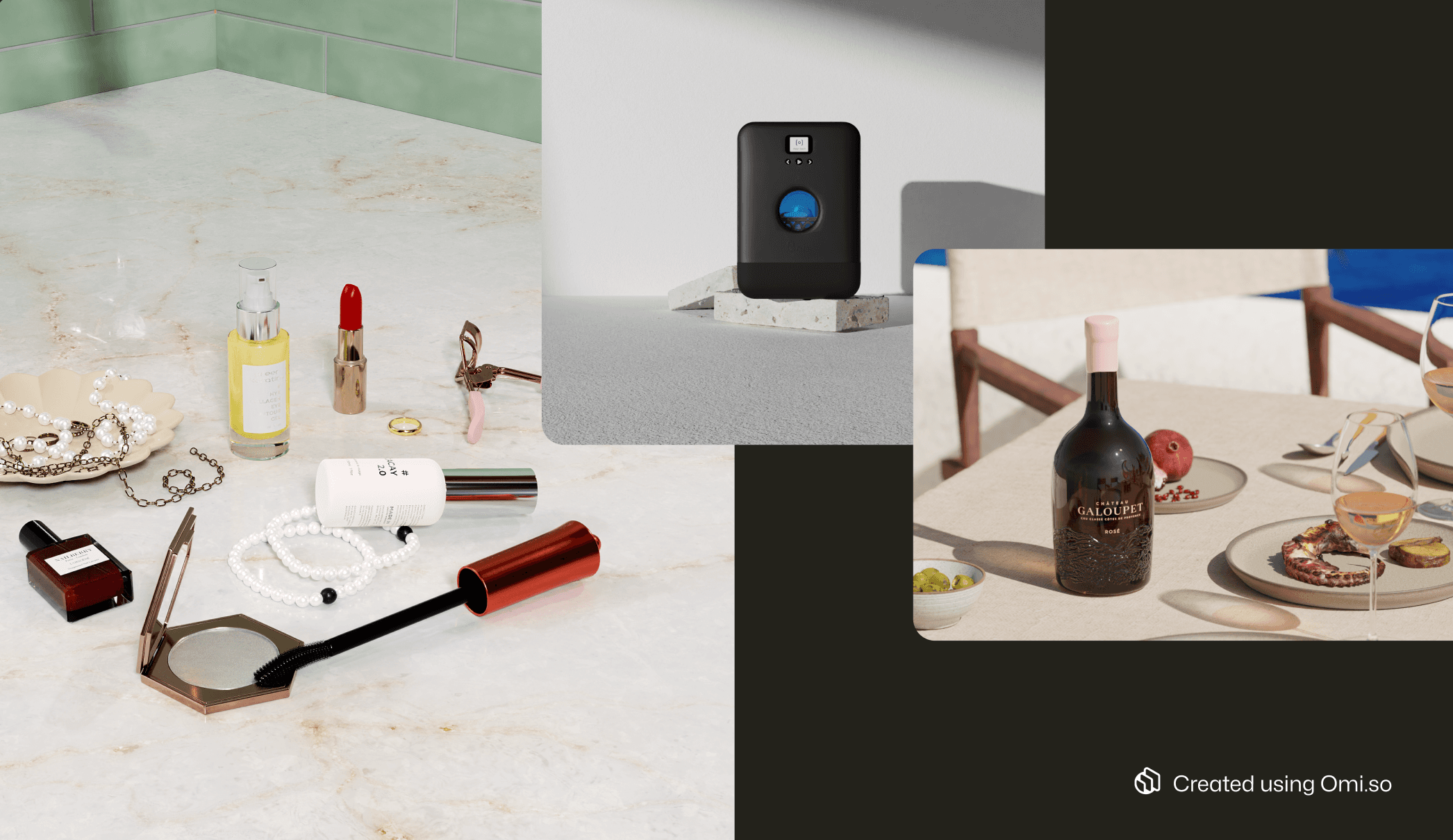
3. Experiment with creative product imagery to capture your customers’ imagination
Whilst the first images on your PDP carousels should be clear and instructive (such as white background product shots), you should also experiment with more creative product photography for some of the images.
Think: props that reflect the lifestyle around your product, dramatic lighting that shows the mood your product evokes, and shots that show it in situ in relatable contexts. For creative inspo, check out these product photography background ideas as well as these examples of minimalist creative product photos.
Use creative images to build associations between your product and experiences your customers would aspire to. This can boost sales by appealing to your customers’ desires.
Use a session replay or heatmap tool to understand whether your users are interacting with your creative product imagery. If tools show your users are lingering on these images, they’ve probably struck a nerve; you should recycle these images in your social media posts and ads.
Omi offers 6,000+ photorealistic 3D props to help you experiment with creative product imagery for your eCommerce.
💡 Pro tip: how well you can execute on creative product photography depends on how much budget, time, and imagination you have. For 43% of marketers, the biggest barrier to creating engaging visuals is producing them consistently. Omi removes the blockers that prevent marketers from consistently producing creative product photography:
It encourages creative experimentation: Omi Studio has everything you need to really play with your product shots. There’s an extensive library of backgrounds and templates, as well as a prop library with over 6,000 items - the only limit is your imagination! |
4. Include user generated content (UGC) for persuasive social proof
Including images of your product that your customers have created is a powerful tactic for boosting your credibility - in fact, it’s the #1 type of product image for building trust with your customers.
Beneath your polished product shots, add a selection of scrappy smartphone images from your biggest fans, either alongside your reviews, or via an integration with Instagram or Pinterest.
The presence of UGC reassures buyers that your product doesn’t just look good hypothetically, on a sanitized product page - it lives up to its promise in the real world! If you are lucky enough to have enthusiastic customers, get in touch and incentivize them to create this for you.
Hero images
Hero images are what goes in your page headers. They’re usually the first thing users see when they land on your site. Here’s a couple of tips for how to get them right.
5. Ensure your hero images support your CTAs for maximum clickthrough
Whilst product images on PDPs are purely there to sell your product, hero images must sell your product and serve as background images for CTAs and headline text.
It’s an obvious point, but make sure that your hero images support the actions you want users to take: text should be clearly legible and your main CTA should be the focal point. Text in images is usually most legible on simple color backgrounds. Strategic use of props in the image may also guide the eye and enhance legibility.
A hero image should capture your audience’s imagination, without stealing the spotlight from your CTA.
Tools like WebAIM can help you test whether your text has enough contrast to be legible, including for users with visual impairments.
6. Create emotional charge with dramatic angles and lighting
Whilst your hero images should support CTAs, they should remain heroic. They need to pack an emotional punch so users feel compelled to stick around - and eventually make a purchase.
Consider using dynamic composition tactics like:
High or low camera angles
Creative lighting setups (such as rim lights, golden hour glows, or dramatic spotlights.)
Shadows or reflections
These small tweaks can shape the mood around your product, encouraging users to register it as important.
These small tweaks can shape the mood around your product, encouraging users to register it as important.
💡Pro tip: with Omi’s Virtual Photo Studio, you can experiment with lighting effects that would require a Hollywood-style team of technicians to achieve in real life. Play around with lighting angles, shadow depth, and reflections to create product shots with charisma. Found an effect that sets off your product just right? You can save the lighting settings as a template for next time. |
7. Consider an animated hero image to increase time on page
Adding subtle animation to your hero images - like a parallax scroll effect or soft movement - can increase user attention and even reduce your bounce rates. They subtly offer a little more for users to look at, thereby increasing your engagement metrics.
Create your animated hero image with a Virtual Photography tool like Omi, and it’ll remain lightweight, so you can get all the benefits of an engaging background image without slowing your page speed down.
With Omi Video, you don’t need a camera crew to create the kinds of dynamic product videos that work well in place of hero images.
Product listing pages (PLPs)
A product listing page is - as the name suggests - the page where all of your products are listed, for the user to filter and browse. It’s the part of your website that looks like a catalog. Here’s how to ensure your PLP images are doing the best job possible.
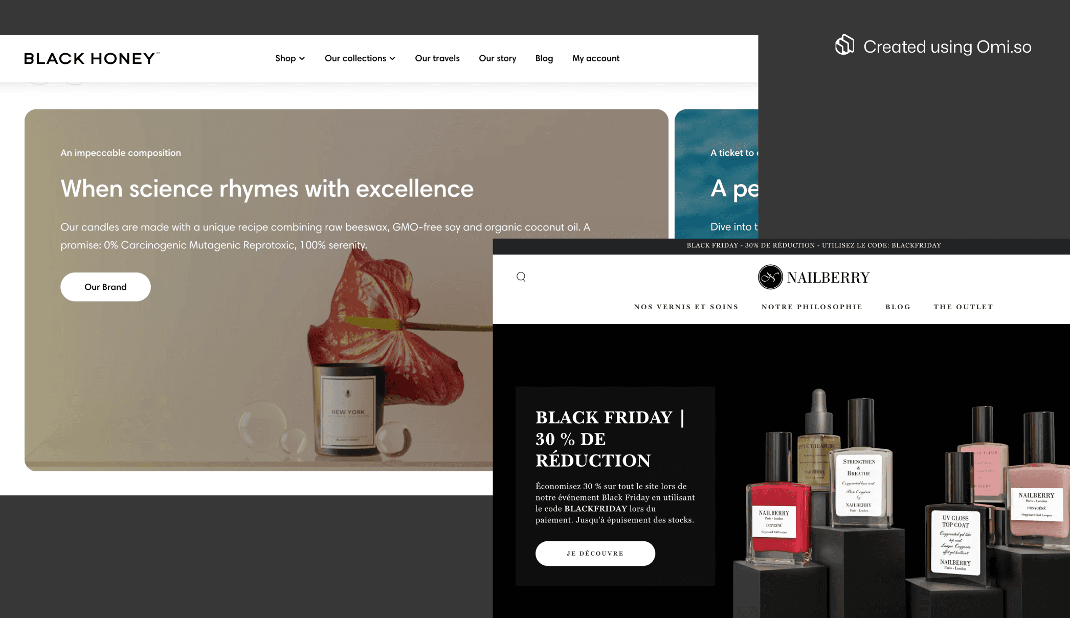
8. Study PLPs in your niche to meet users’ expectations
Product listing pages - those catalog-style webpages that show thumbnails of a large number of items at once - typically require small, white background images of your product, in a square aspect ratio.
However, you should see how your competitors create PLPs, since best practices vary in different eCommerce verticals. For example:
Fashion retailers often have experimental or artistic PLPs. Just take a look at Zara, where all clothing items are shown in a lifestyle image, taken on location
Hardware shops that sell small parts often show their products tiled very small, using white background photography - for example, Wickes
Home goods retailers often show images of their products in situ on their PLPs - just check out Sklum
This is one product image type where visual conventions depend on your category. Customers expect certain types of shots based on what they’re shopping for, so do a little research to get this right.
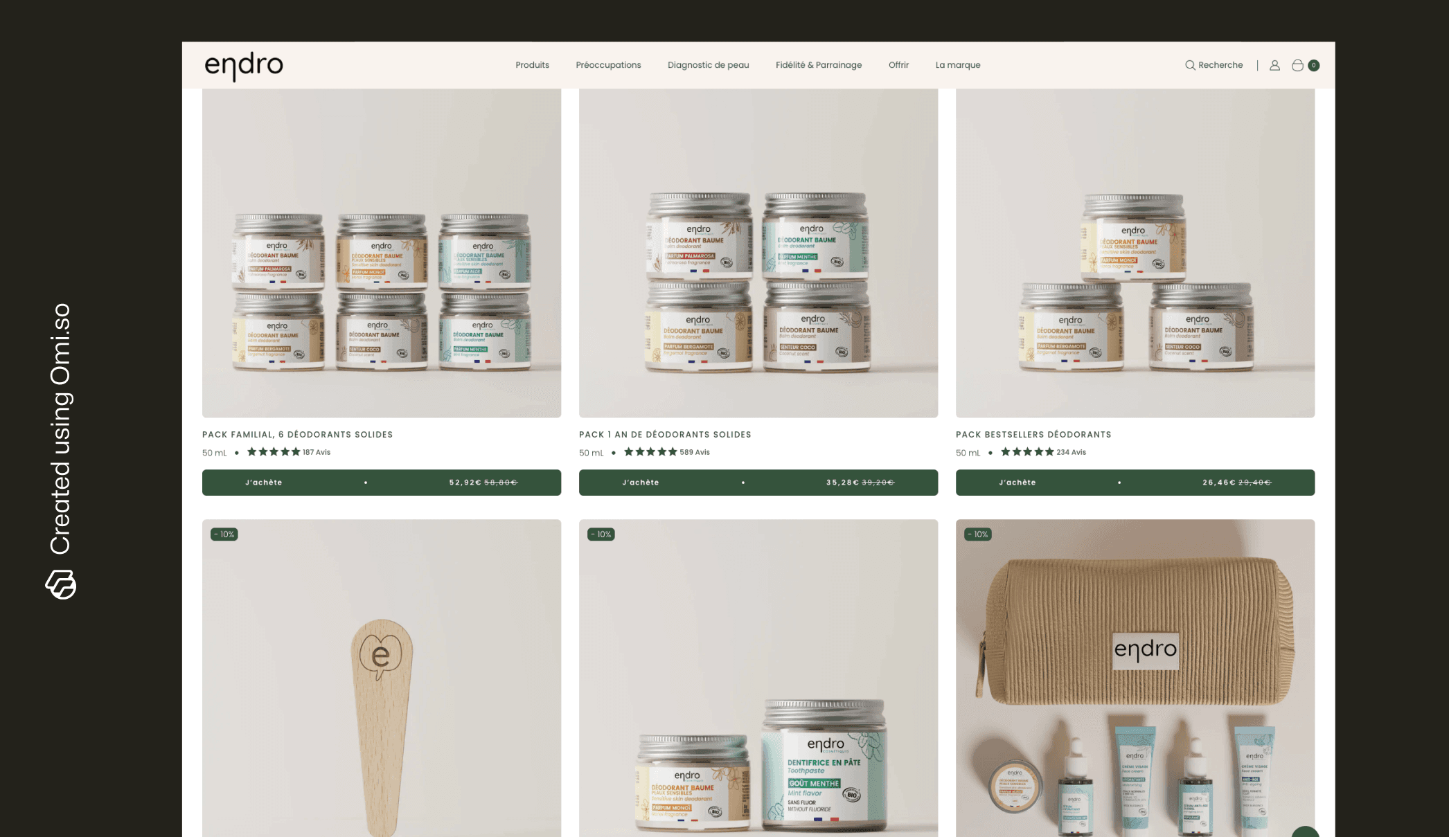
The photos on Endro’s main PLP have the same color palette and aspect ration. Yet, they’re compositionally different enough to engage users’ attention.
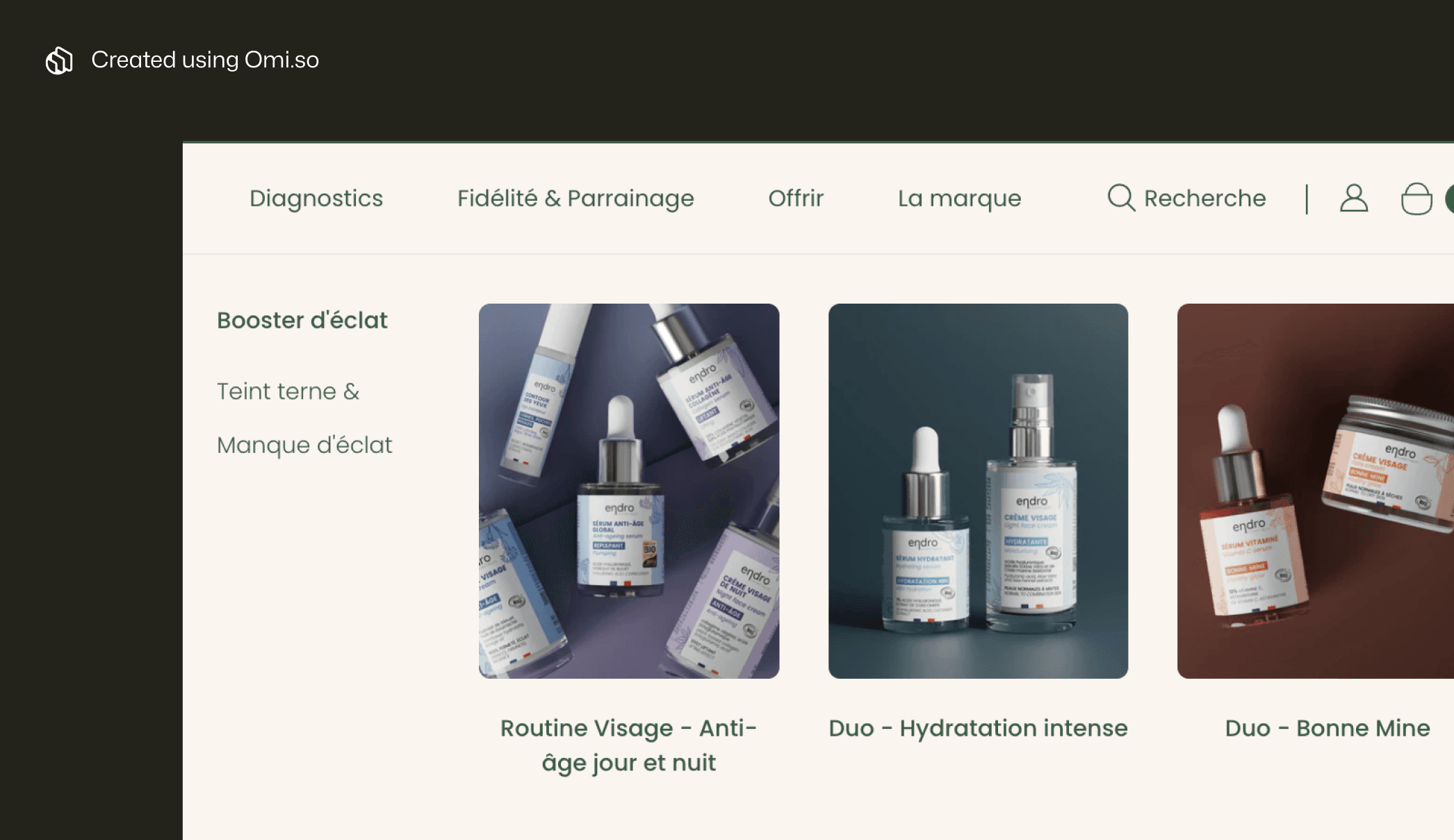
Some of Endro Cosmetics’ PLPs use color to help users distinguish between product categories.
9. Build trust by keeping PLP images consistent
This is the page where potential customers scroll through dozens — or even hundreds — of your products. If the images are too dissimilar from each other you’ll give them a headache! Not to mention, give them a sloppy perception of your brand.
Even if you’re in a vertical where PLP images are often creative, these product shots should have:
Similar lighting and compositions
The same size and aspect ratio
Uniform background styles
Matching scale and margins
Cohesion builds trust and makes browsing easier on your customers’ eyes.
Best practices
The following best practices apply regardless of whether your eCommerce image is on a PLP, a PDP, or some other page acronym entirely.
10. Add alt-texts to serve customers with accessibility needs
Whether we’re talking hero, PDP, or PLP, every product image should include an alt-text that accurately describes its contents. Alt-texts are what they sound like—the alternative text that appears if your image isn’t available. They make your website accessible to those with visual impairments, since they allow people who use screen readers to hear a description of the image they can’t see.
Alt-texts should be dense and under 125 characters. For example, in the case of our hiking rucksack example, you might write: “Black waterproof hiking rucksack with 30L capacity and padded straps”
Alt-texts also help Google Images to index your product shots, giving your images more visibility in relevant searches. It’s a virtuous circle!
11. Use the right image resolution for a polished appearance on all screen sizes
You should have high standards when it comes to image resolution for your product shots. Blurry, low-resolution pictures are universally considered unprofessional - and conversely, gigantic image files will slow your site’s load time and negatively affect your SEO.
Generally speaking, your product images should be around 2000px on the longest side, to allow viewers to zoom in on details, and avoid pixellation on retina displays. You should also consider using modern file formats like WebP and AVIF for efficient compression.
Finally, check how your images appear on different devices. With 59% of 2025’s eCommerce sales taking place on mobile, it’s vital that all aspect ratios work just as well on the small screen as they do on desktop.
12. Avoid problems down the line by obeying image copyright laws
Do you have 100% rights to use any images on your site? In perpetuity and in all markets? This may seem like a small point, but glossing over image copyright issues can lead to no end of legal complications down the line.
If you’re working with product photographers or stock images, check the small print of your contracts.
If you’re selling a white label product B2B and using images of customers’ products, solicit usage permissions carefully. Unexpected usage restrictions happen - and it’s a logistical nightmare you can avoid.
Pro tip: if you’re using Omi’s Virtual Product Photography studio to create your product shots, image copyright is a non-issue. You own 100% rights to any images you create, in perpetuity, everywhere in the world (and beyond). That’s one less thing to worry about! |

Beverage brand, Jane, uses Omi to create images of every size for every platform.
Takeaway
Ensuring your product imagery meets best practices involves a lot of moving parts. You’ve got to deliver the kind of visual impact that captures customers’ hearts, whilst also setting realistic expectations about your product.
And keep one eye on technicalities like aspect ratios, resolution, and usage rights.
Not every product photo you create will live up to all these best practices—and if you’ve got high standards for your brand, that can mean a lot of expensive re-shoots.
One solution? Switching from traditional product photography to a Virtual Product Photography tool like Omi.
With Omi, you can push the creative limits of product photography, change the size and shape of your images at will, and produce as many variations of your images as you like — whilst scaling back your image creation budget by up to 90%. It really is a no-brainer.


