5 Key Elements of Product Photography Composition
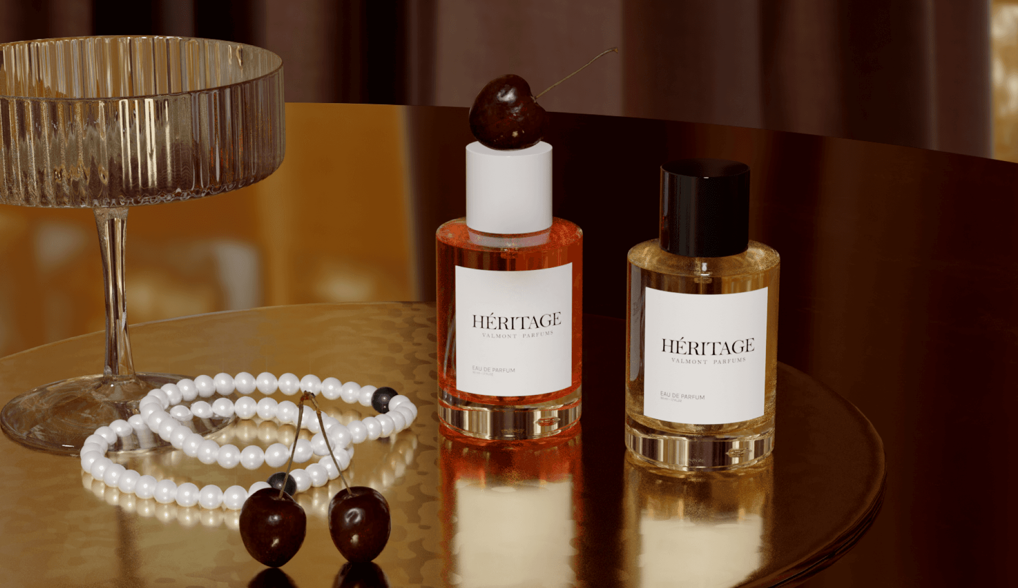
Are you producing pared-down packshot photos for PDPs? Or the kind of dazzlingly creative product photography that wins ad clicks? Either way, constructing effective product imagery means successfully managing key elements of composition.
Between the extortionate cost of product photography and today’s high volume demands, marketing teams are increasingly creating these images themselves, using Virtual Product Photography tools like Omi. If you're one of those marketers, you’ll need to master basic compositional principles on the job.
The good news? Bringing this process in-house pays off. Using Virtual Product Photography typically reduces content spending by 70% - 90%, while offering more creative control over your brand image.
In this article, we’ll explore the 5 most important elements of product photography composition, with practical tips you can apply right away to make your visuals fit for purpose.
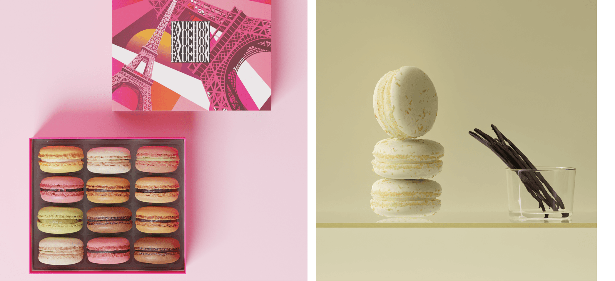
1. Props
Unless you’re shooting a white background photo for a PDP or PLP, props are a storytelling tool you should leverage. They help reinforce your brand and hint at how the product fits into your customer’s life. But there’s a fine line between styling and visual noise.
There’s a risk for props to:
Steal the spotlight, and draw more attention than the product itself
Clutter the composition by introducing unnecessary complexity that confuses the viewer
Send mixed signals or imply a use case or setting that doesn’t align with your product’s actual function
When styling shots with props, avoid these pitfalls by asking:
Does this prop help tell a story my customer relates to?
Is it adding clarity or providing distraction?
Can I reduce the number of props and still communicate the same idea?
If it looks intentional and matches your brand, a slightly cluttered or maximalist scene can be an effective strategy for social media posts and ads that need to drive qualified traffic to landing pages.
But even in those cases, the visual hierarchy of the image should clearly favor your product.
Start with three props max and arrange them following a compositional rule. If the image feels empty, you can add more items in from there.
💡 Pro tip: With traditional photography, finding the perfect props for eCommerce product photography can be a scavenger hunt. If you’re using Omi’s Digital Twin technology, this problem disappears. There’s a library of 6k+ read-to-use props to help you come up with product picture ideas - and you can resize or recolor them too. Once you’re happy with your prop compositions, you can even save your scene as a template for future use. 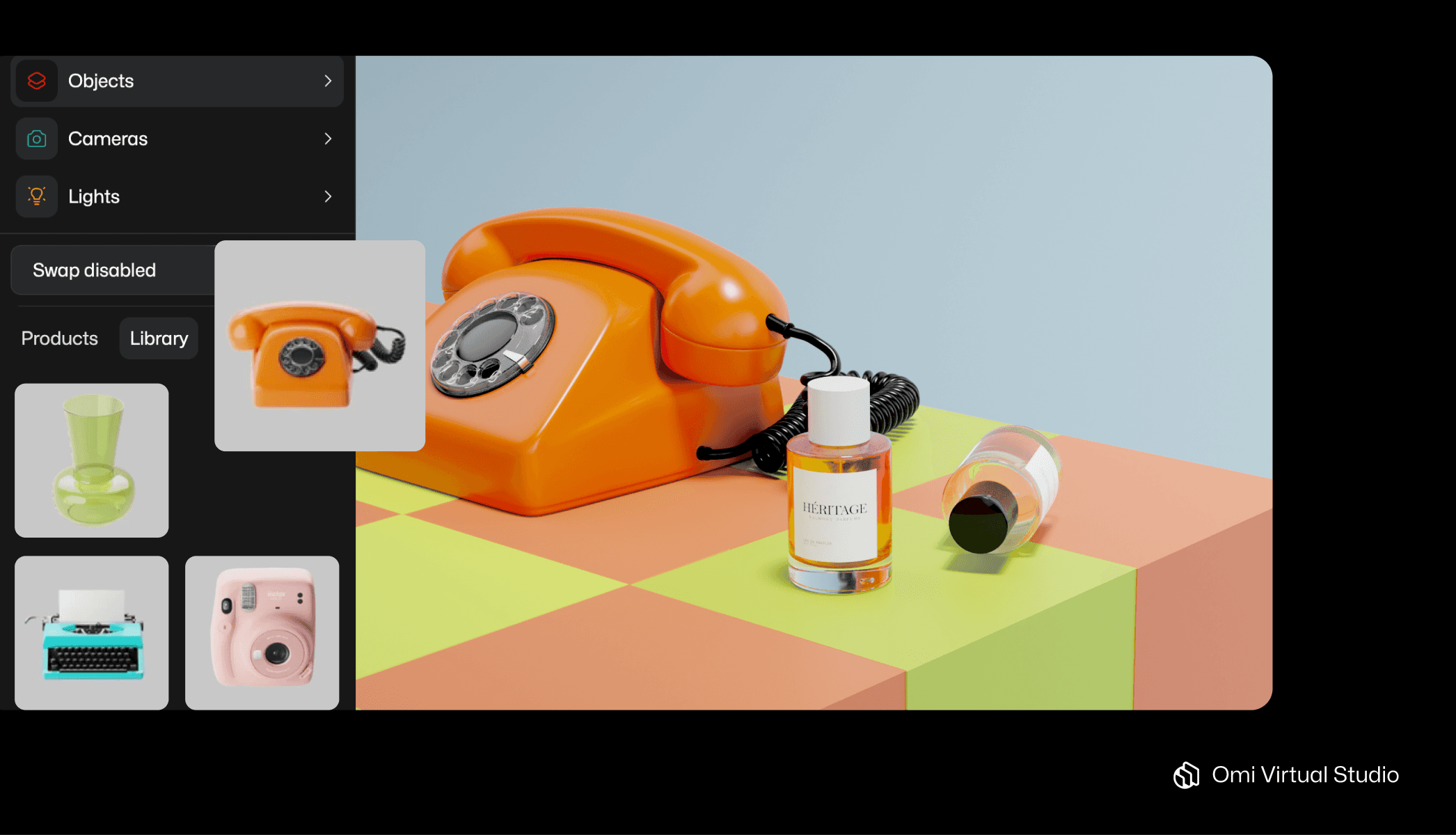 Omi’s prop library offers thousands of 3D props that will be rendered with photorealism to contextualize your product in your scenes. |
2. Colors
It’s tempting to consider color as a separate factor from composition, but doing so can undermine your attempts to create a harmonious image. After all, color is tied to visual weight, with bright or dark colors appearing ‘heavy’.
Consider the distribution of color around your composition, using a tool like the color wheel. The color wheel organizes hues in a circle to show relationships between primary, secondary, and tertiary colors.
By consulting a color wheel, you can build effective palettes:
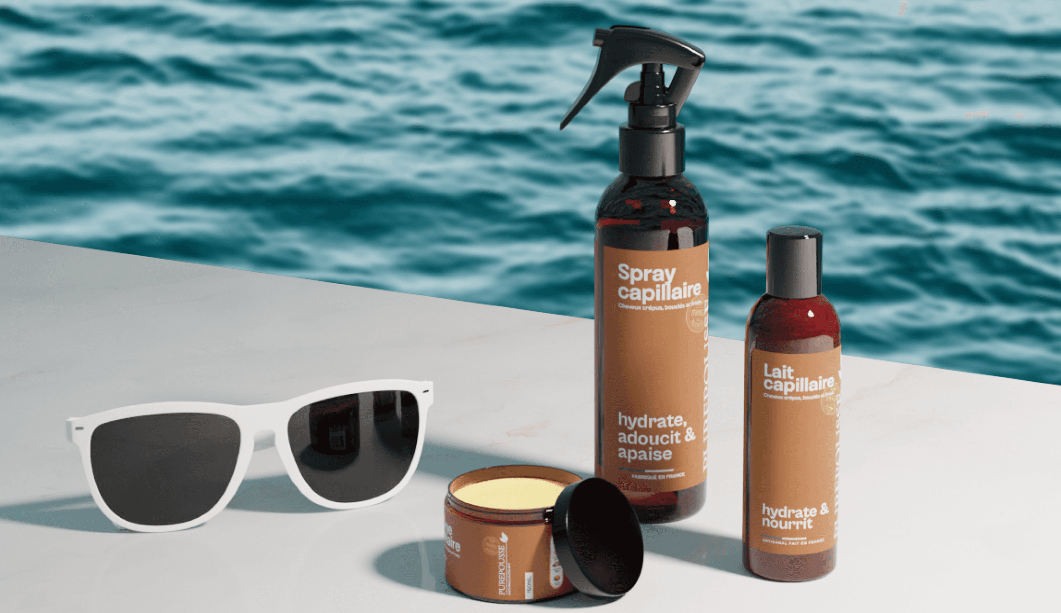
Harmonious (or analogous) colors sit next to each other on the wheel. For example, when blue, teal, and green are shown side by side the combination feels natural and cohesive. This makes them ideal for creating a calming, elegant look, and for marketing channels where cohesion is required, like PLPs and category pages. Skincare brands often style their products in soft greens and blues props to evoke freshness and nature that convey the value proposition of their products.
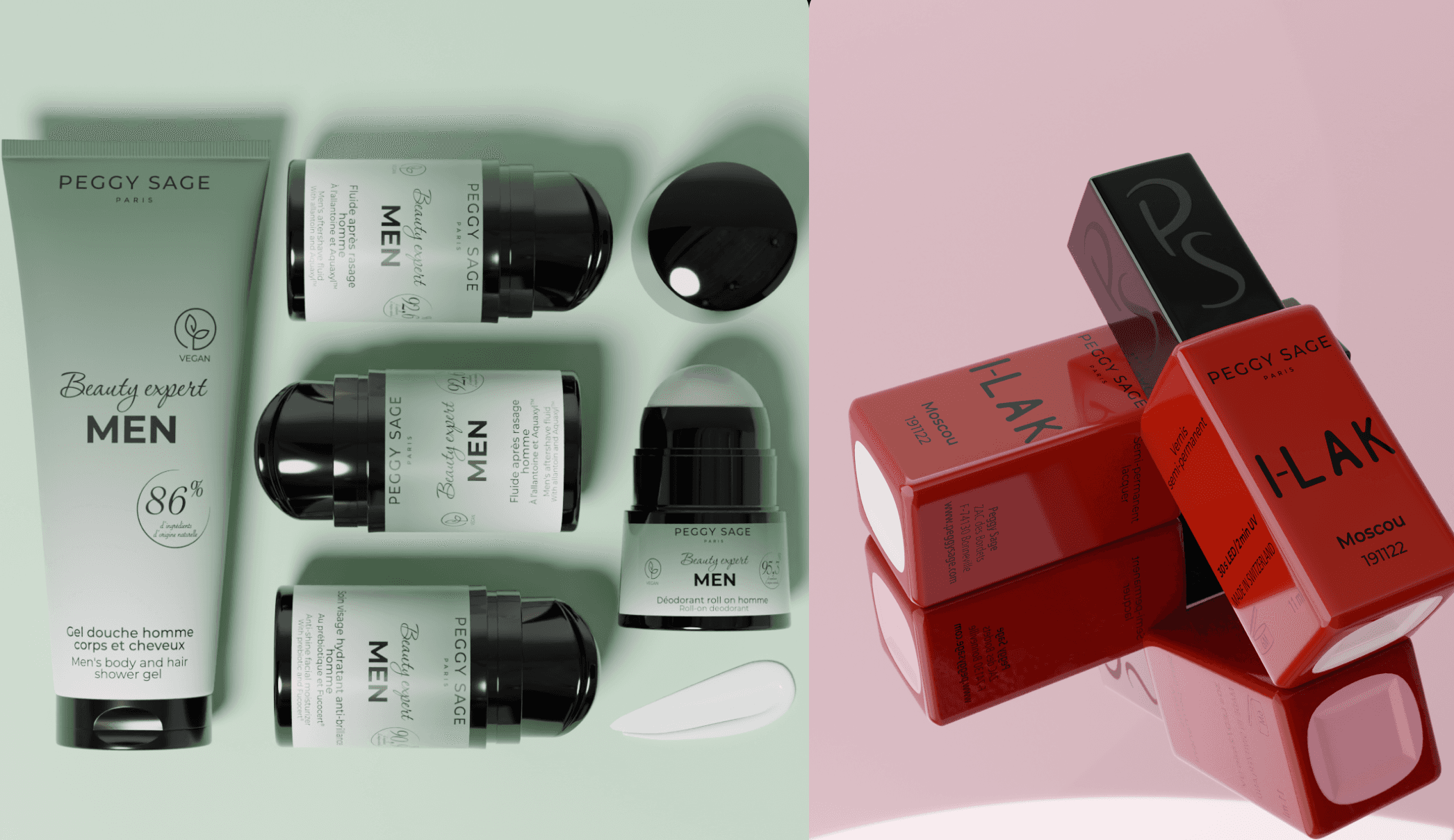
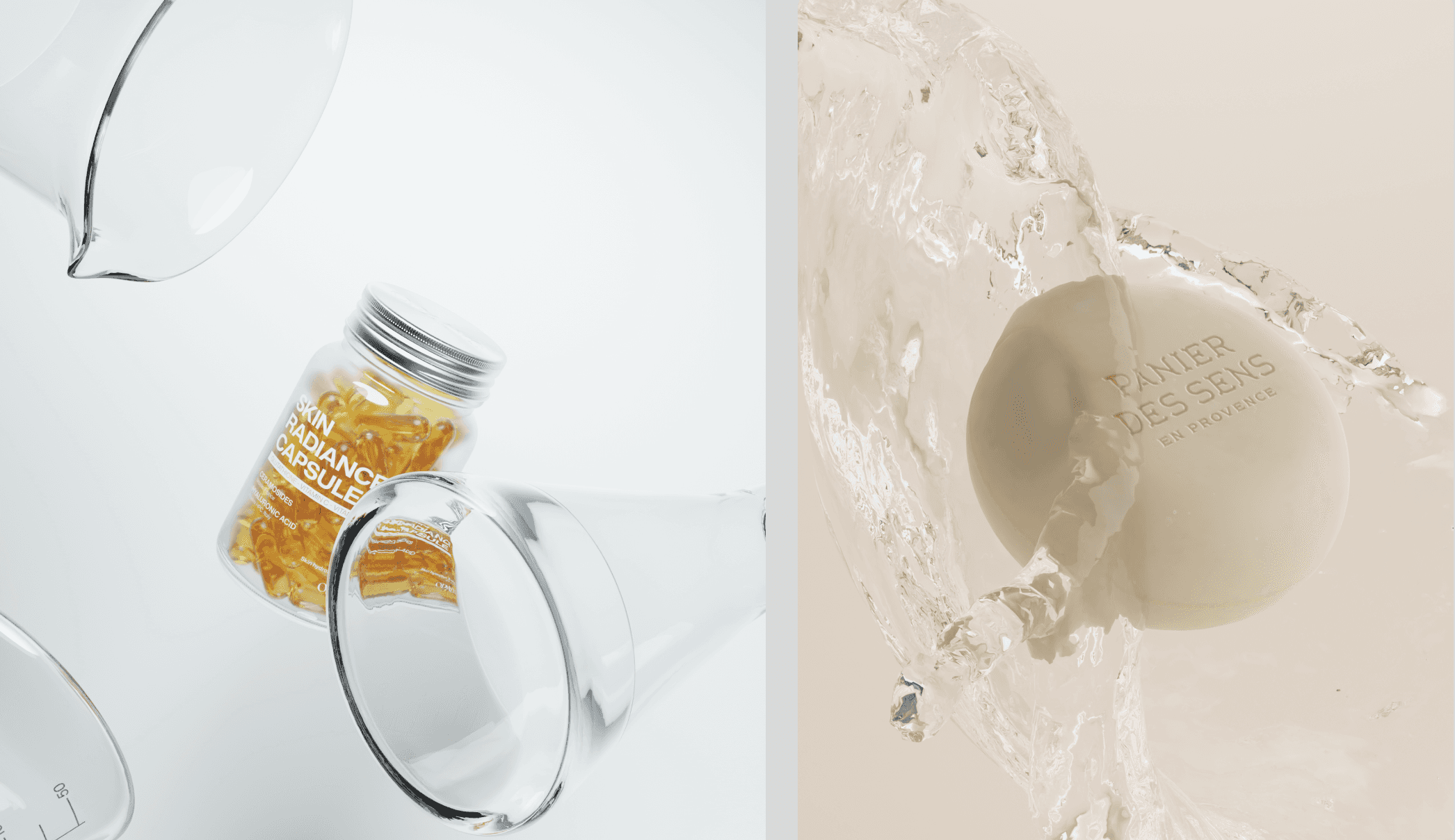
Neutral tones are found nearer the center of the color wheel. Consider using neutrals like white, grey, or beige for backgrounds, to give the eye space to rest. This is particularly relevant for minimalist creative product photography.
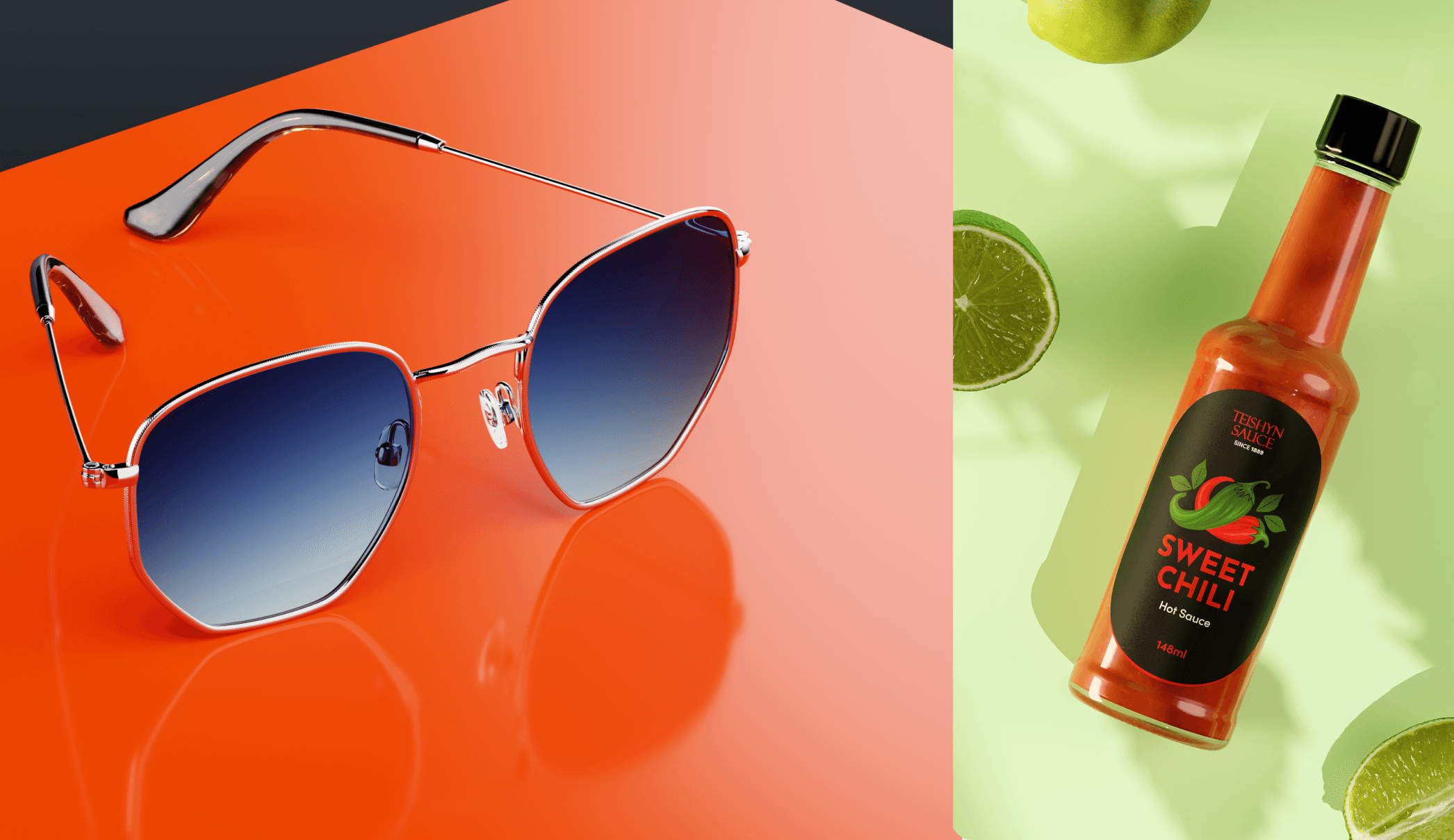
Complementary colors are directly opposite each other on the wheel. Like blue and orange, or red and green. These pairings create strong contrast and energy, drawing immediate attention. Complementary schemes are great when you need to make a bold impression: think website headers, ad creatives, and social posts.
Whichever palette you go with, try to balance the colors within your photograph so there’s not too much of any one color in any part of the photo.
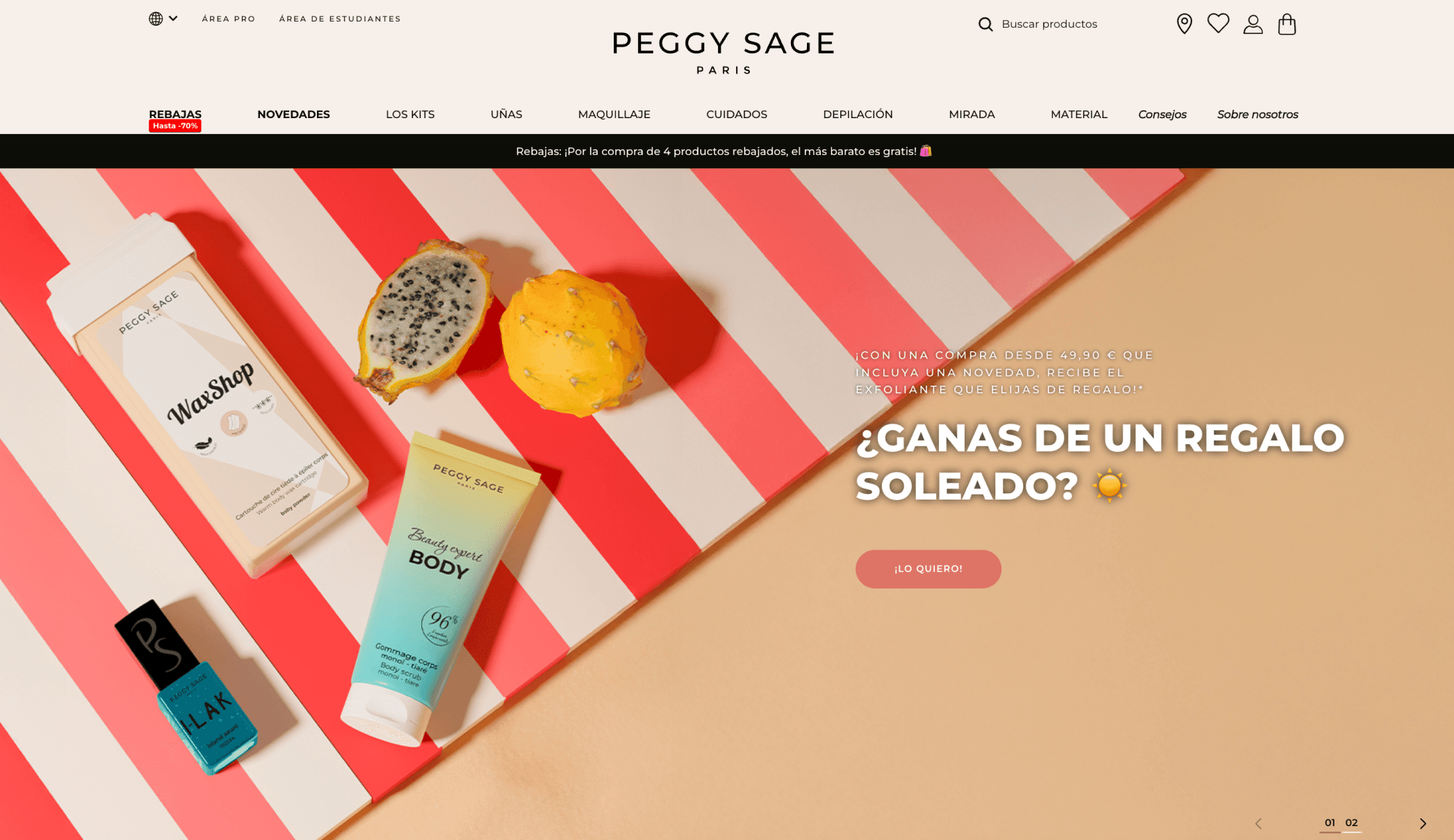
See it in action: beauty brand Peggy Sage used complementary colors to create a summer-themed website banner that really pops. Check out the vibrant blue of their product against the beachy red background.
💡 Pro tip: in traditional photography, colors often need touching up in post-production. Props that initially looked red might seem orange under intense studio light, leading to brand consistency faux pas that require fixing. When you create product shots with Omi, you have total control over the color scheme. Props that appear in the prop library menu as light grey are editable. That means you can change their color, either by selecting the one you want from the color wheel, or by entering an exact hex code. You can also change the background color in just a couple of clicks. 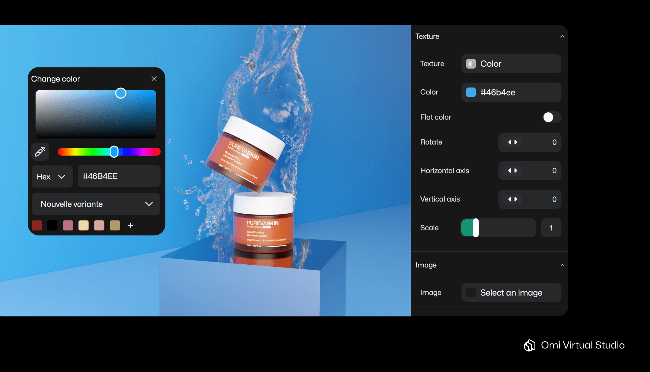 With Omi, you can align the color of your props and background to the Hex code specified in your style guide. |
3. Light
Light is another often-neglected compositional element, which has a bearing on many of the rules discussed above. For example, when considering visual weight, remember that darker areas tend to feel ‘heavier’ in composition.
Light also plays a crucial role in establishing hierarchy within an image. The viewer often looks first at the area where the light hits most directly; consider how you want to guide this attention.
For the most effective use of lighting possibilities, experiment with:
Directional light (side or backlight) to create depth and texture for premium items like leather or ceramics. This is useful for PDP images, since the effect can be subtle, allowing for clear communication around product details.
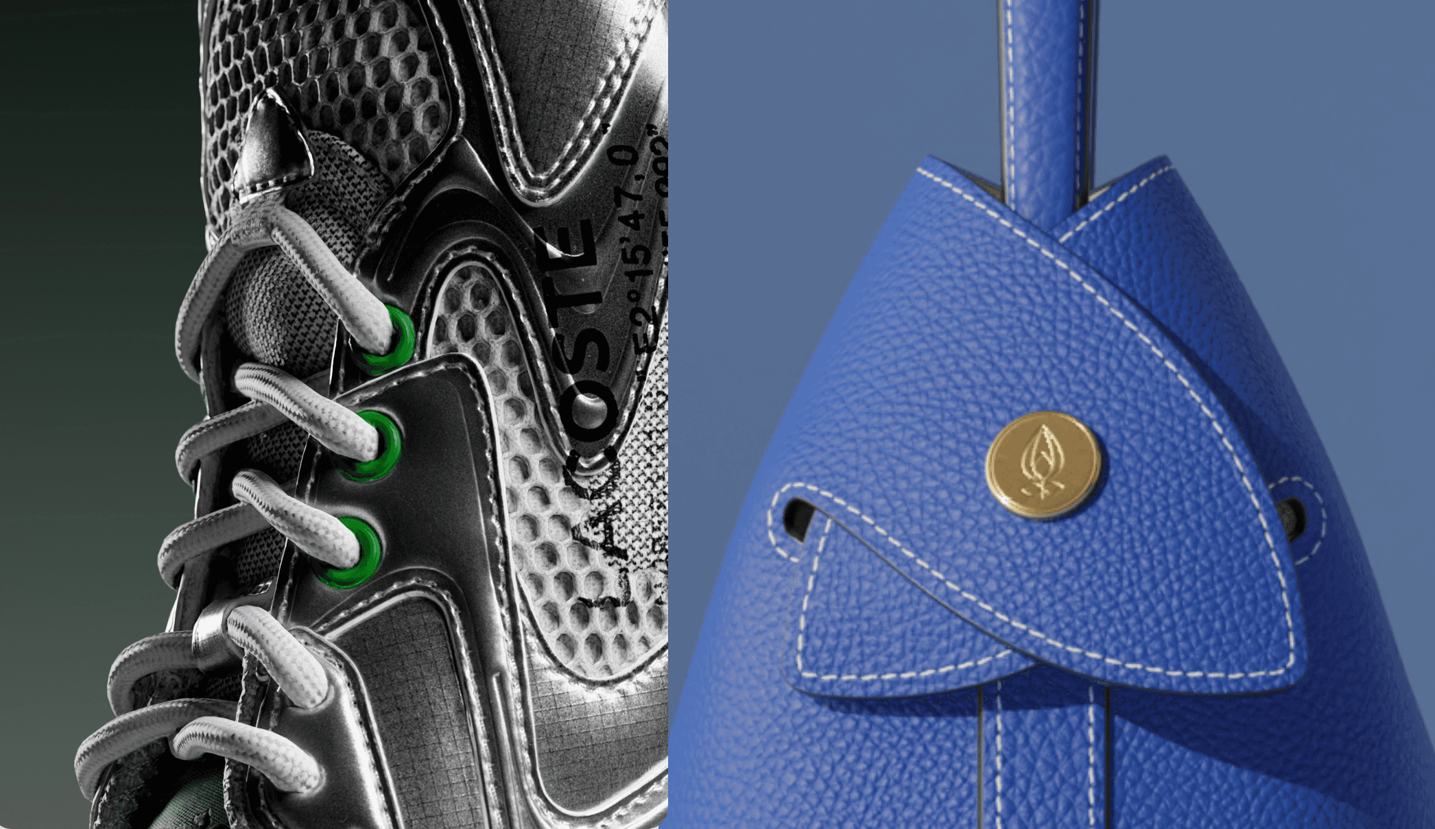
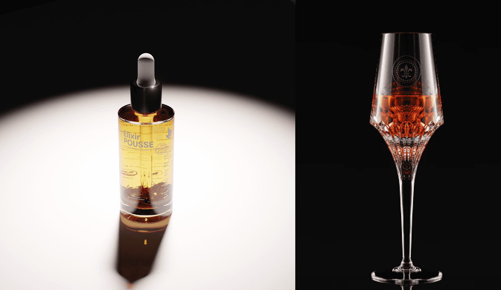
Low lighting with deeper shadows for luxury, fragrance, or tech.This lighting technique is especially effective for images that need to capture attention (and, therefore, clicks) like banners, social media posts, and ad creatives.
Spotlights to pull focus to a hero product, such as your best-selling moisturizer. Use subtle spotlights for PDP and PLP images, and explore dramatic ones for hero shots, ad creatives, and social posts. Like low lighting, spotlights are particularly useful for adding a theatrical touch to product launches.
See it in action: beauty brand Esthederm used a moving spotlight to create a product launch video, which had been promoted with teaser images for weeks. As you can see, they made good use of Omi's video add-on.
💡 Pro tip: if you’re using Omi to create Virtual Product Photos, you have a Hollywood-style lighting set-up at your command. The Virtual Studio allows you to shoot your product with a large variety of pre-made and custom lighting settings. You can even save your favorite lighting settings as templates to create similar product shots in the future. This means you can tailor lighting to suit different brand aesthetics: from soft, natural daylight for clean beauty to dramatic, high-contrast setups for luxury tech. Whatever mood and tone you’re going for, you can use lighting to evoke it in just a few clicks. 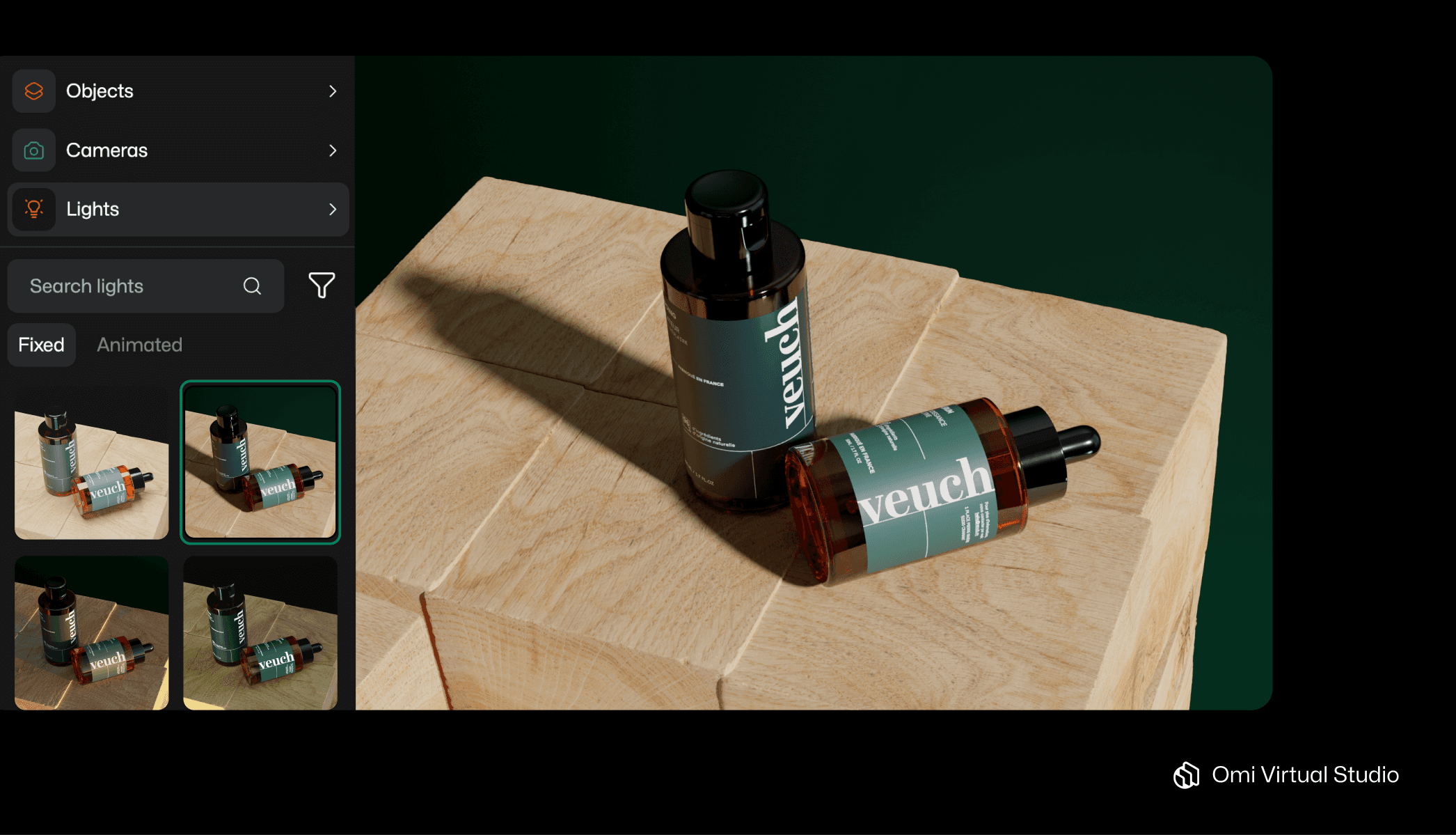 Omi user Veuch exploring Omi’s menu of fixed lighting settings (note how each one lends their cosmetics products a subtly different atmosphere!) |
4. Camera angle
The angle you shoot from communicates subtle information about your product, and has a bearing on composition. For example:
A straight-on shot offers a neutral, trust-building angle that shows customers exactly what they're buying, which helps conversions. Use it for PDP and PLP shots.
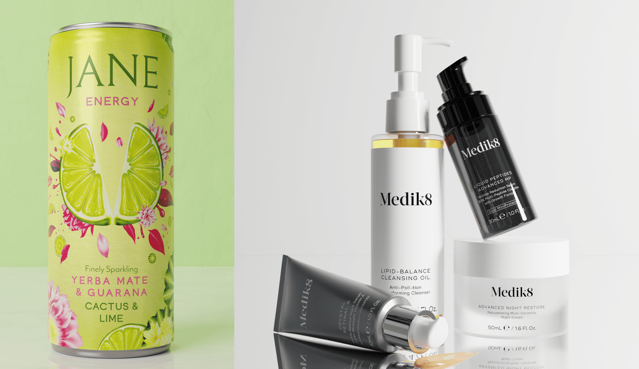
A low angle elevates the product both literally and figuratively. In comic books, this is the angle used to show that superheroes are powerful. In product photography, it’s used for luxury items like watches, fragrances, or high-end electronics to signal power and exclusivity. It’s a great fit for Lead Gen banners that need to convert, or website headers that aim to increase time-on-page metrics.
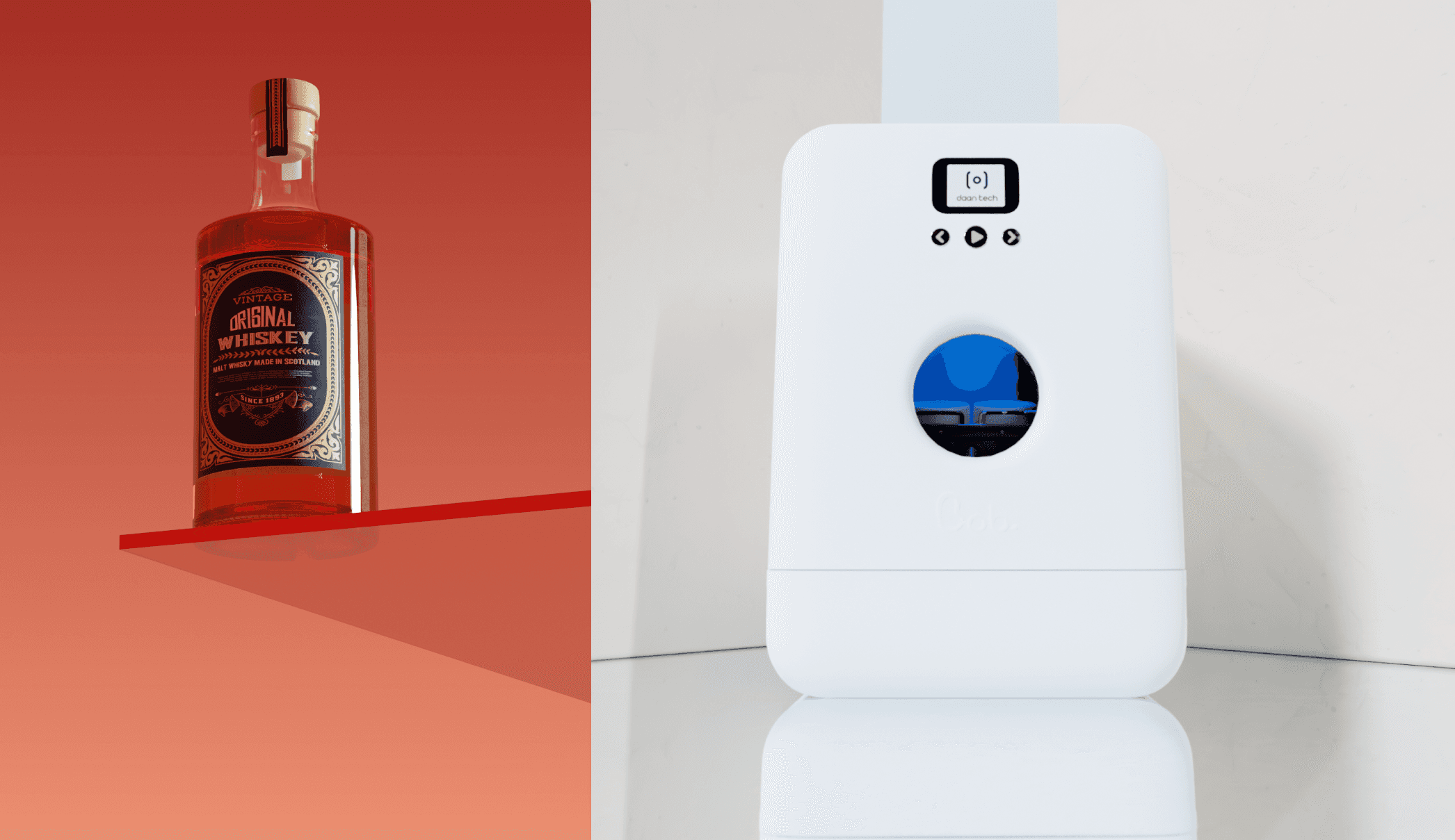
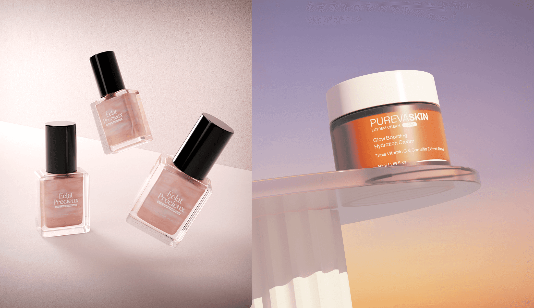
Dynamic tilt or Dutch angle, the camera equivalent of tilting one’s head to the side, creates tension, motion, or an offbeat vibe. This makes it a useful trick for creative campaigns featuring high-energy products like sports gear, and to make ads with higher Ad Recall.
A high angle will make your product feel accessible or functional, since the viewer is larger than the product. These angles are often used in food and skincare lifestyle shots, where tabletop images make contextual sense.
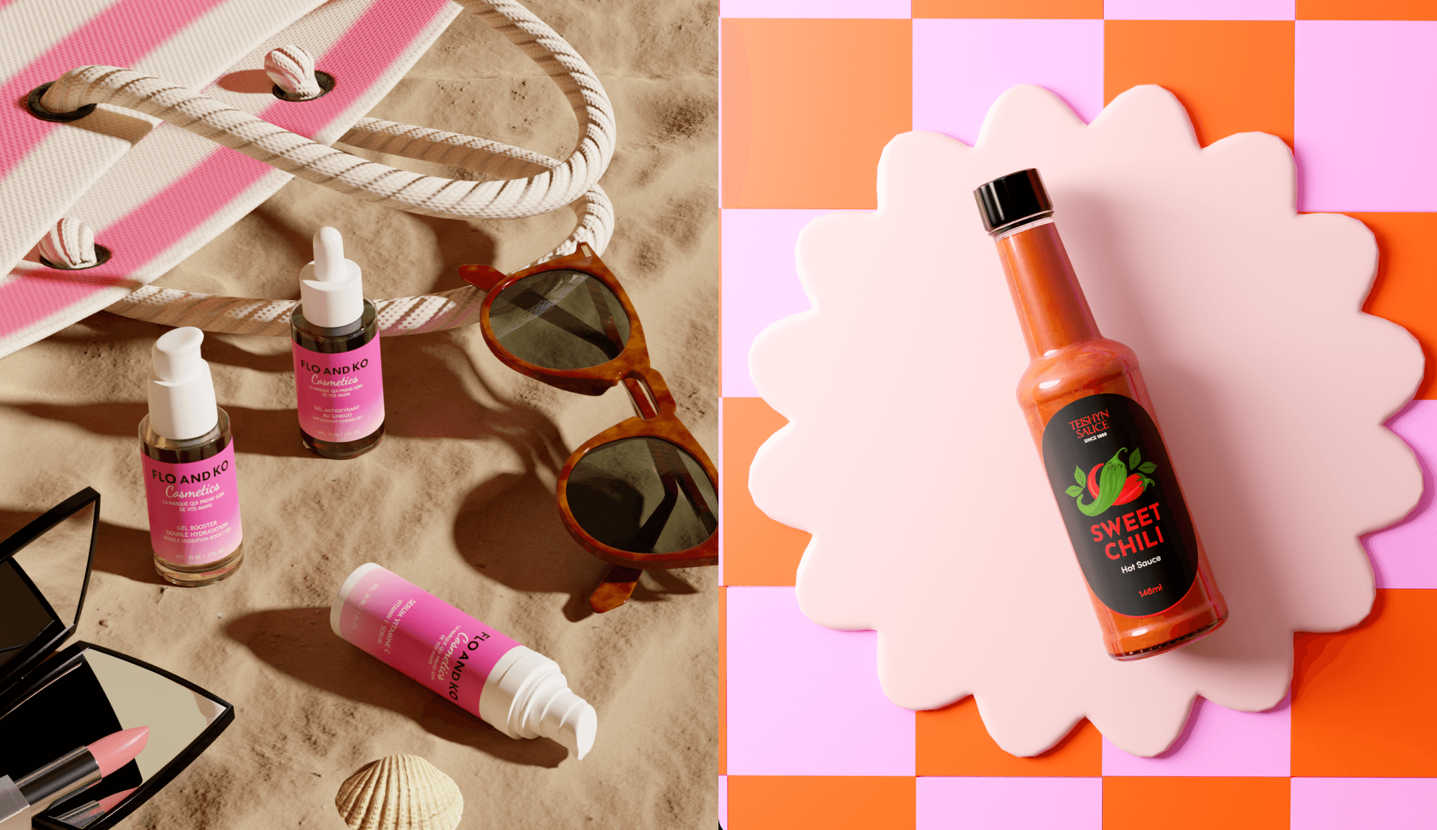
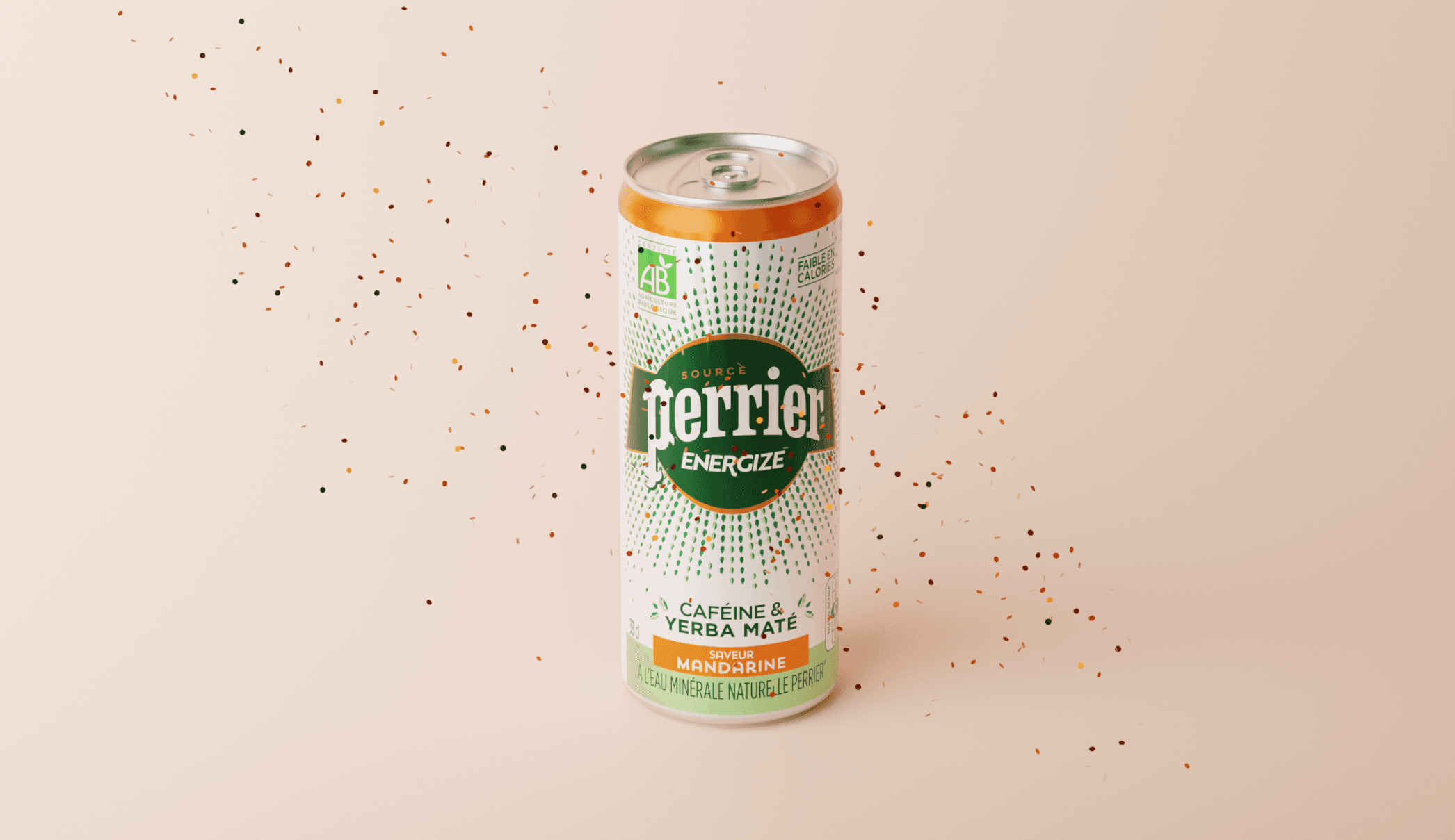
See it in action: Beverage giant Perrier used a high angle camera lens to create this Virtual Photo of their new energy drink, Perrier Energize. This is true to how customers usually see their energy drinks – from above, since the can is small - and also makes the product feel accessible.
💡 Pro tip: if you’re using Omi, you don’t need a fancy tripod to shoot your product from every angle possible. You can make it look like your luxury perfume is falling down from heaven, or like your buyer is gazing at your tricycle from the perspective of a child. 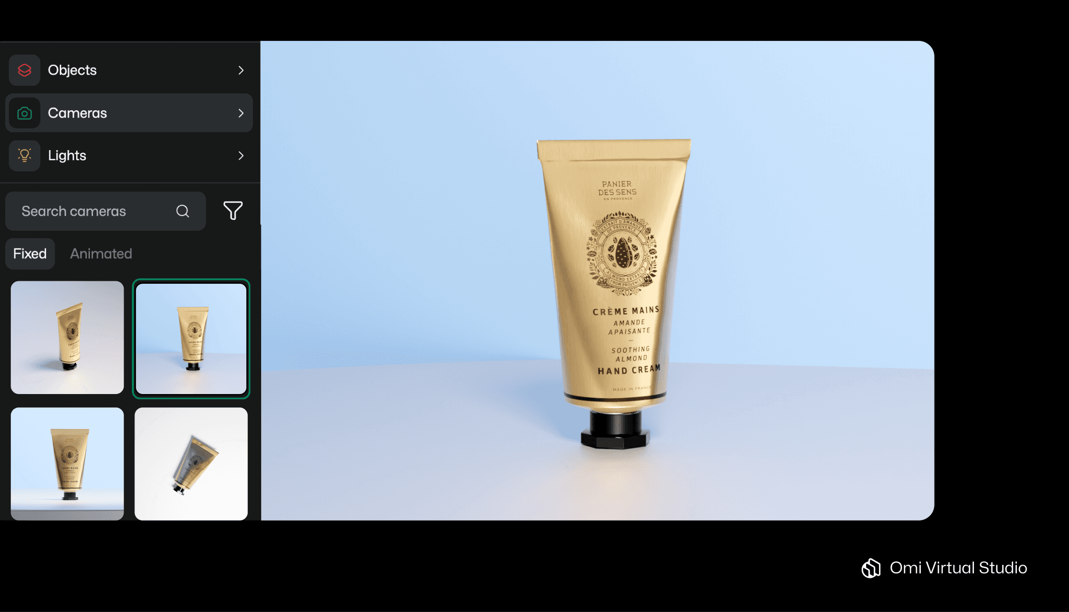 With Omi Studio, you can experiment with a menu of fixed camera angles (seen here) or adjust the exact angle yourself. |
5. Focus
Focus is another compositional tool that shows your viewer where to look. A shallow depth of field (where only part of the image is in focus) creates intimacy and directs the viewer’s eye to a specific detail. This is ideal for close-ups of textures and features, as found in the later slides of a PDP image carousel.
In contrast, deep focus ensures every part of the scene is crisp, which can be useful when showcasing multiple products which need to be equally visible. This is useful for product category landing pages, and website banners in general.
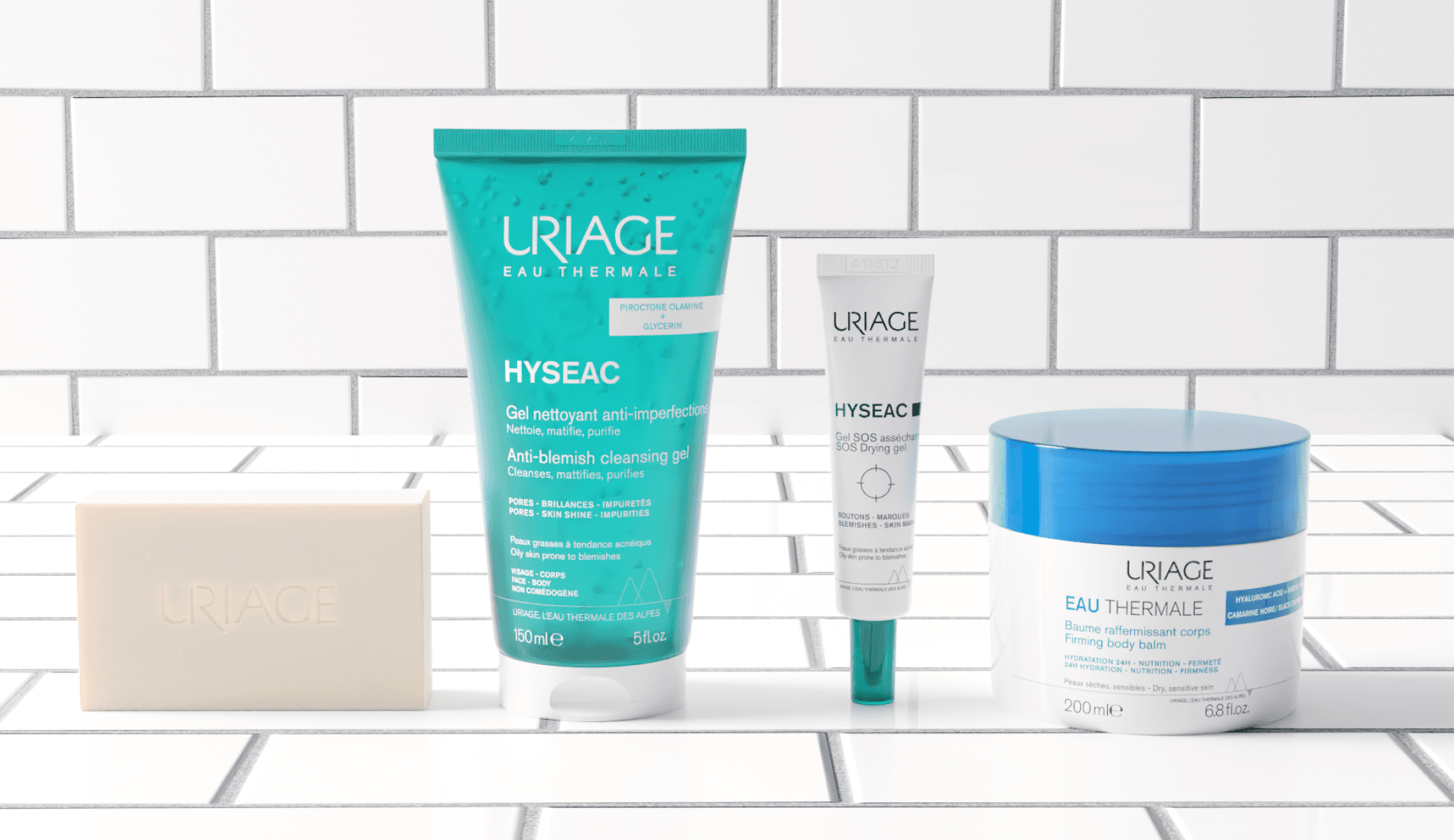
See it in action: Moët Hennessy wine estates used a shallow depth of field in this captivating lifestyle image, presenting their wines in crisp focus against a blurred summer scene. This makes the background feel subtlety evocative, but avoids drawing attention away from the products on view.
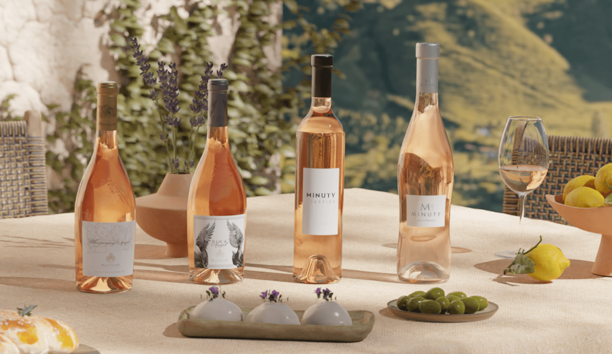
💡 Pro tip: Omi users have complete control of how the (virtual) camera focuses on their product shots. Want to use focus to follow the rule of thirds, and blur out two sections of your image? Or create a diagonal strip of focus across the center of an image? With Omi, you can explore the full creative potential of this compositional element. 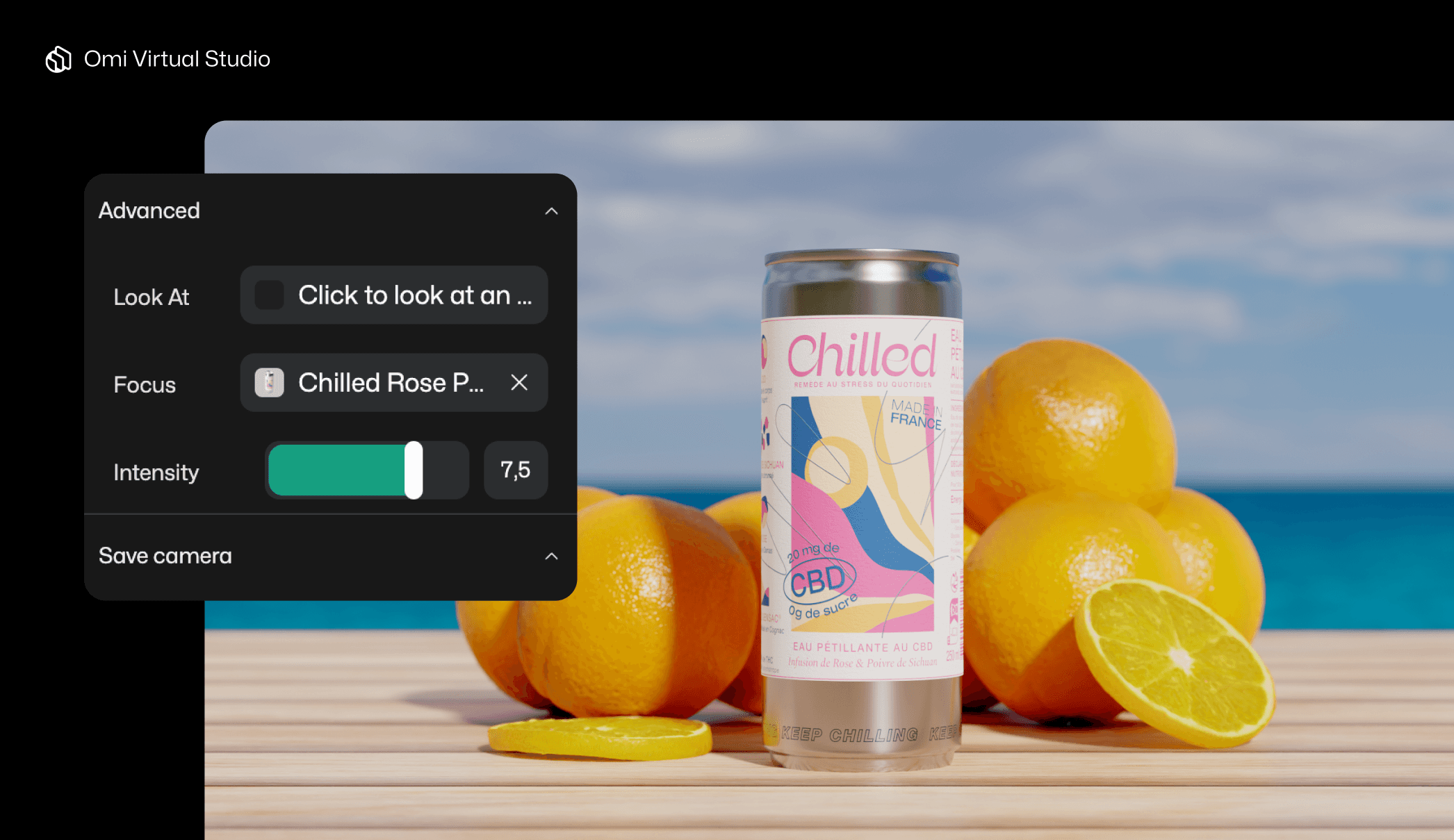 |
Consider these 5 elements for more successful product images
Product shots are unlike most types of images, in that you can measure how successful they are. PDP images must be clear and true-to-life in order to convert customers; social images must be dynamic and surprising to stop users from scrolling past them.
To create successful product images, marketers must think in terms of props, color, lighting, angle, and focus. Whilst this may seem like a lot to consider at once, if you’re using a tool like Omi, you can control all of these elements on demand, from the same intuitive interface. Mastering composition becomes a simple matter of strategy, rather than a complex one of directing photographers, lighting artists, and graphic designers.
When you own the composition, you own the story your product tells - and in eCommerce, the right story is what makes customers click “buy.”

