Color Trends in Beauty & Cosmetics Visuals
Dive into five of the most influential color trends currently shaping beauty branding: Soft Pink, Gen-Z Green, Matcha Mochi, Malibu Blue, and Winter Forest.
These shades are more than aesthetic. They communicate mood, positioning, and brand values; with each featured color capturing a distinct emotional register.
This article recaps Chapter 2 of the 2026 BEAUTY & COSMETICS VISUALS TRENDS report. The analysis was based on a staggering 20,000+ brands in the industry, and was commissioned by Omi.so. In the report, beauty brand analyst Jennifer Carlsson reveals the formative trends in Macro, Color, and Visuals emerging out of changes to societal values, consumer behavior, and digital culture.
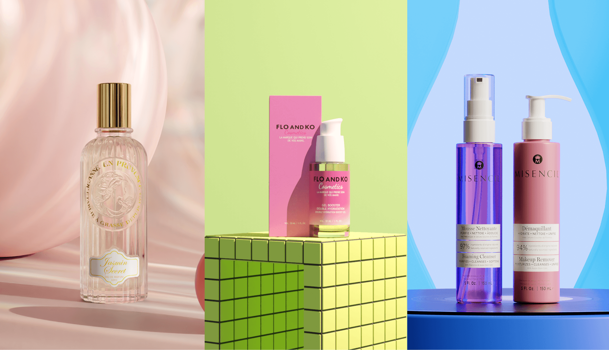
Color trend 1: Soft Pink
A gentle, airy pink reminiscent of cotton candy and flushed cheeks, evoking comfort, tenderness, and playful innocence. Emotionally, it taps into themes of vulnerability, tenderness, and warmth - offering a subtle form of escapism in turbulent times.
It’s an approachable, universally flattering hue often associated with softness, empathy, and emotional openness.
This shade lends itself well to skincare packaging designed to feel nurturing, or makeup collections that emphasize natural radiance and self-love. It’s commonly used in brands that speak to emotional well-being, self-kindness, and gentle rituals.
Soft Pink pairs well with creams, beiges, and muted pastels for a dreamy, cohesive look. It’s frequently used to evoke softness, intimacy, and warmth through rounded typography, and tactile, matte textures.

In bolder applications, Soft Pink is also paired with bright red to create striking visual contrast - adding an unexpected, attention-grabbing edge to an otherwise delicate palette. This combination channels a modern romanticism that feels both playful and assertive.
Part of what makes Soft Pink so enduring is its adaptability. It appears across every price point from luxury brands to drugstore lines and can be styled to suit a wide spectrum of aesthetics.
When paired with other soft pastels or a tonal pink palette, it conveys gentle femininity and approachability. Used with white, black, or gold, it takes on a more refined, upscale tone.
As a base colour offset by bold accents - like electric blue, red, or chartreuse - it becomes unexpectedly modern, youthful, and visually impactful.
Whether leaning into cuteness or sophistication, Soft Pink remains a flexible and emotionally resonant choice.
Color trend 2: Gen-Z Green
Gen-Z Green is a high-energy fluorescent yellow green that radiates joy, creativity, and irreverence. With its citrusy vibrancy and digital-native brightness, it reflects a generation’s desire for bold self-expression, optimism, and playful rebellion against convention.
Psychologically, Gen-Z Green captures the feeling of early spring, new ideas, and unconventional confidence.
This colour is perfect for low-commitment, high-visibility items like lip tints, colourful mascaras, or limited-edition drops. In other words, it works best when the tone of voice is informal and fun. It signals trendiness and experimentation, especially appealing in Gen Z-targeted mass-market beauty.
Makeup brands Made by Mitchell and Half Magic Beauty both use Gen-Z Green as a defining element of their brand identity, leveraging its bold, unconventional character to stand out in a saturated market.
Beyond color cosmetics, it’s also commonly used as an accent by science- and ingredient-focused brands like By Wishtrend, Drunk Elephant, and Naturium, where it injects a sense of freshness and innovation into otherwise clinical or minimalist visual systems.
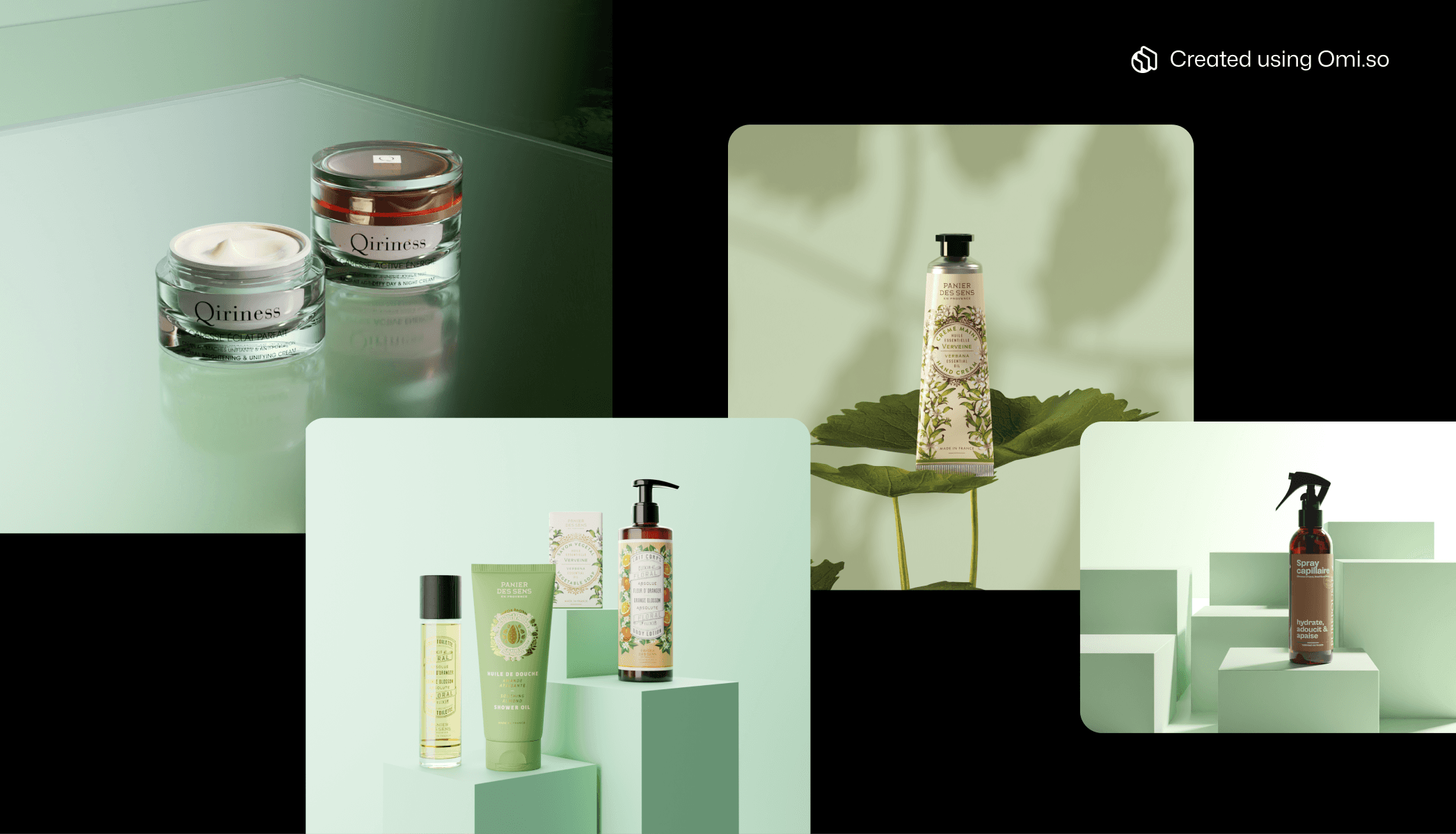
Color trend 3: Matcha Mochi
Matcha Mochi is a calming, muted green reminiscent of soft, powdered matcha and chewy mochi desserts - creamy, pastel-toned, and delicately subdued. It captures a sense of quiet luxury and embodied ease, delivering visual comfort without slipping into dullness.
Soothing and soft, the colour evokes feelings of tranquillity, clarity, and emotional softness. It brings a meditative quality to the visual language of beauty like a slow breath in a chaotic environment.
This shade operates at the intersection of wellness and nature, referencing both botanical origins and the cultivated aesthetics of contemporary tea rituals. It feels grounded yet refined, offering an antidote to overstimulation and the synthetic gloss of maximalist branding.
In contrast to brighter greens associated with Gen-Z energy or eco-activism, Matcha Mochi feels introspective. Gentle, present, and quietly confident.
A versatile fit for clean beauty, wellness-forward skincare, or naturally positioned haircare, it communicates balance, purity, and soft-focus efficacy.
The color’s muted tonality reinforces product attributes like hypoallergenic, soothing, or daily ritual-oriented - ideal for brands looking to align with slow beauty, hormonal wellness, or biocompatible formulations.
Visually, Matcha Mochi pairs well with translucent packaging, minimalist typography, and tactile materials like frosted glass, matte plastics, or soft-touch finishes. Used in contrast with metallics or creamy whites, it can skew premium and elegant; paired with playful shapes or textures, it becomes more inviting and emotionally resonant.
Ultimately, Matcha Mochi green delivers modern sophistication without sterility. It balances the emotional resonance of nature with the aesthetic restraint of minimalism - perfect for brands seeking to cultivate calm in a saturated market.
Color trend 4: Malibu Blue
Malibu Blue is a bright, refreshing blue that instantly evokes the optimism of clear skies, shimmering pools, and sunlit coastlines. Reminiscent of 2000s surf culture and retro resort aesthetics, this shade radiates energy, freedom, and youthfulness.
Its visual clarity offers a counterpoint to the saturation of overstimulating digital spaces, providing a moment of visual exhale - cooling, crisp, and uncomplicated.
Emotionally, Malibu Blue taps into themes of escape and recharge, making it especially effective for conveying clarity, hydration, and renewal. There’s an inherent fluidity to this hue, both literal and symbolic. This connects easily with product narratives around water, air, and movement.
This shade is especially popular for hydration-focused products - creams, gels, masks, serums, and mists that emphasize deep moisture or barrier support. Malibu Blue suggests a water-rich, sensorially soothing experience, often used to differentiate gel textures or formulas designed to quench and plump the skin. It also complements messaging around cooling, replenishing, or post-sun recovery.

Commercially, Malibu Blue is most prevalent in SPF, body care, and summer-focused ranges, where it visually communicates cooling effects, high hydration, or beachy playfulness. Increasingly, it’s crossing over into haircare, fragrance, and wellness categories to highlight product functions like invigoration, lightness, and breathability.
The colour works well for positioning products as effortless, functional, and fun, while still feeling premium when paired with white, chrome, or ice-toned Neutrals.
It’s a versatile colour for brands looking to tap into feelings of freshness, freedom, and clarity—a palette cleanser that feels nostalgic but contemporary.
Color trend 5: Winter Forest
Winter Forest is a deep, saturated green that draws directly from evergreen pine, cedar, and fir - botanical symbols of permanence, regeneration, and endurance.
This hue conjures misty alpine woods, stillness, and shadowed undergrowth, evoking quiet luxury and elemental depth. Its mood is grounding and introspective, often associated with ritual, resilience, and time-honoured care.
Emotionally, Winter Forest invites a return to slowness and intention. Unlike bright or vivid greens, this shade communicates a mature kind of calm - less playful, more deliberate. It resonates with consumers seeking emotional stability, depth, and authenticity, rather than trend-driven stimulation.
In a visually noisy marketplace, this colour signals substance over spectacle.
It’s frequently used in heritage-inspired branding, especially for gender-neutral or prestige grooming products, as well as in formulations that draw from traditional herbalism or apothecary sensibilities.

Common product categories applying Winter Forest include scalp care, facial oils, fragrance, and botanical hair treatments - any item intended to signal ritual, rebalancing, or deep nourishment.
Its weightiness makes it ideal for products that promise long- term benefits or multi-sensory grounding.
Visually, Winter Forest pairs elegantly with off-blacks, smoky neutrals, and metallic gold or bronze. In packaging, it excels when rendered in dark glass, brushed metals, or velvet-touch plastics with embossed logos, tonal foiling, or monogram-style iconography. These tactile elements reinforce the message of refined longevity and discreet opulence.
Positioned correctly, this colour doesn’t shout - it anchors. Winter Forest is ideal for premium positioning with a subtle, intelligent edge, offering a modern take on old-world sophistication that feels as appropriate for a luxury boutique as it does for a forest spa.
Explore these trends for your brand
The aesthetics-driven nature of this industry means brands have to embrace current trends to remain relevant with today's audiences.
Yet trend adoption comes with challenges. Long-standing creative direction naturally resists new things. Additionally, production costs and lengthy timelines make it difficult to defend experiments.
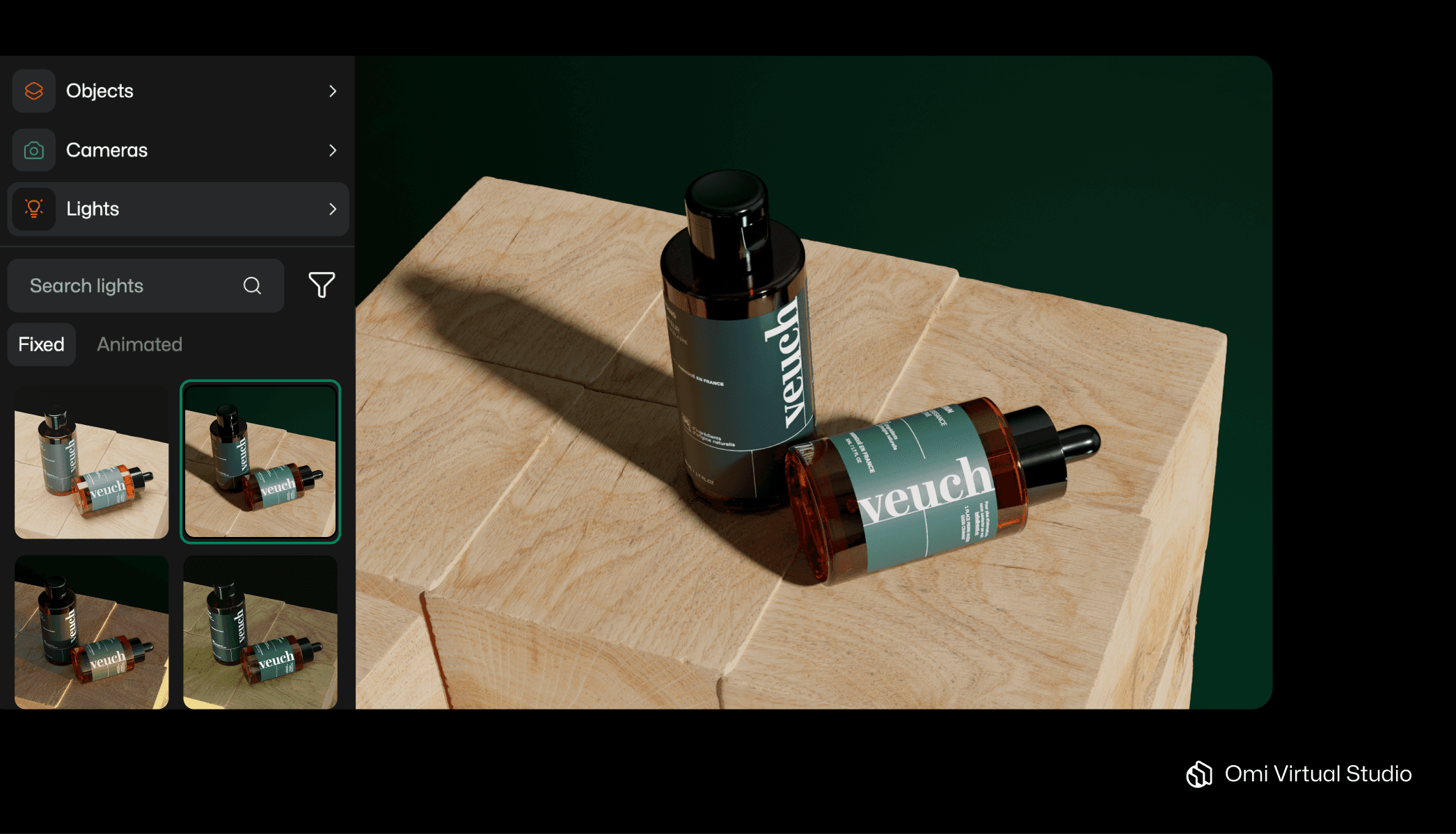
This is where Omi's Virtual Photo Studio bridges the gap between fast execution, creative integrity, and budget constraints. Featuring pre-built scene layouts, an extensive library of 3D props, and endless brand customization options, you have the flexibility to explore trends cautiously or boldly push creative limits.
Discover below how Omi gives you creative freedom.
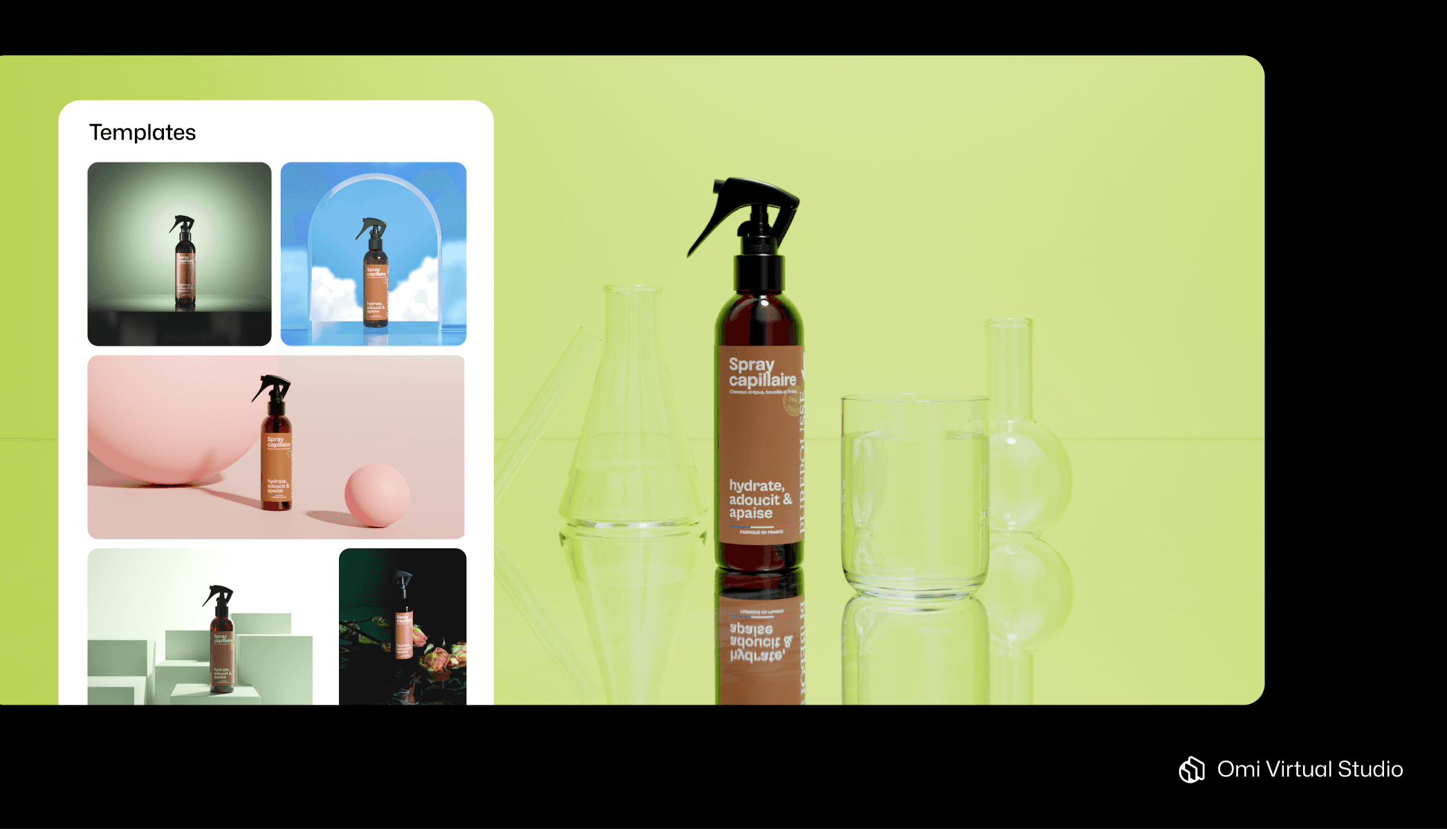
Find a composition using templates
All of the 300+ included scene designs are completely customizable, from colors to accessories to camera angles. Brands of all sizes in all industries use templates constantly to kickstart their marketing projects - no matter how much of the original design they decide to keep.
To modify a template to fit color trends, you should pick a template for its general composition and tone. Then you tweak it to the color scheme (using the color picker) and remove or add accessories as needed.
The following template collections should get you started.
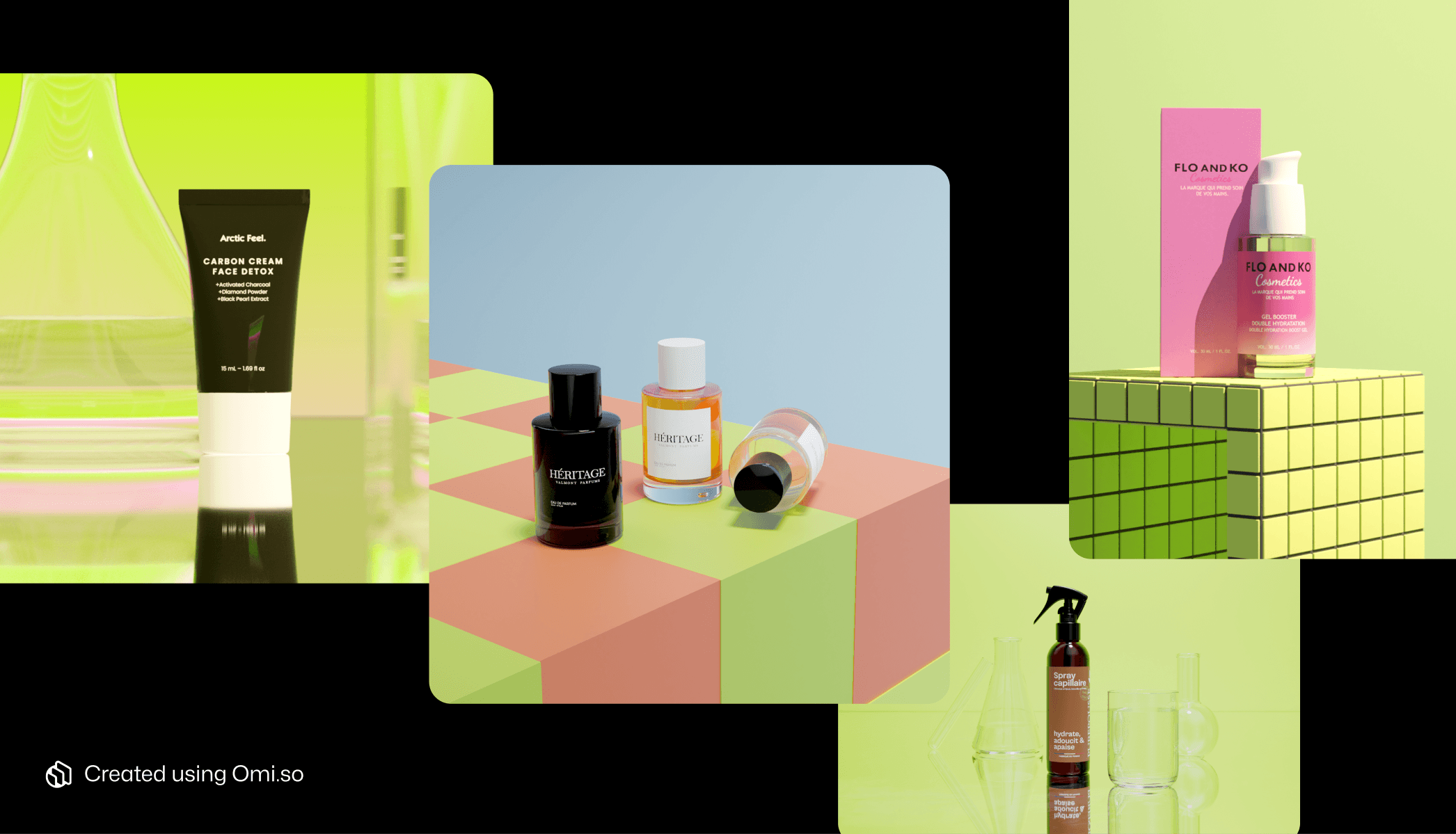
For Soft Pink (Color trend 1), we recommend browsing the 'Abstracts,' 'Bathrooms,' 'Shelves,' 'Spring,' 'Flowers,' 'Cosmetics,' or 'Fragrance' templates. Once adjusted to soft pink hues, these compositions will evoke the dreamy tenderness and emotional well-being this trend embodies.
Templates good for Gen-Z Green (Color trend 2) include the 'Neon,' 'Abstracts,' 'Glass Line,' and 'Laboratory' categories. When updated with vibrant greens, these dynamic layouts will capture the bold experimentation and playful rebellion of this trend.
For Matcha Mochi (Color trend 3), check out templates within 'Fruits,' 'Wine,' 'Flowers,' 'Cosmetics,' or 'Jewelry.' After applying the gentle matcha tones, these compositions will convey the tranquility and quiet confidence that define this aesthetic.
Malibu Blue (Color trend 4) works beautifully with 'Abstracts,' 'Summer,' 'Spring,' 'Nature,' 'Beverages,' and 'World Music Day' templates. Transform these with bright blue shades to achieve the refreshing optimism and youthful energy this trend represents.
And for Winter Forest (Color trend 5), explore the 'Wood,' 'Wine,' 'Nature,' 'Black and White,' or 'Father's Day' collections. Once recolored with deep forest tones, these templates will deliver the maturity, authenticity, and quiet luxury that characterize this saturated look.
Pick your own color scheme
Add your brand’s hex codes or use the built-in color picker to grab one from the scene. You can change the color of your background, floor, many objects (typically the blank white ones), and even the light.
For Soft Pink, layer different pink tones from blush to rose.
With Gen-Z Green, go bold with lime and neon shades.
Matcha Mochi calls for muted sage and mint pastels.
Malibu Blue shines with crisp cyan and aqua hues.
And Winter Forest demands deep emerald and pine tones for that saturated, luxurious feel.

Decorate your scenes
Scene accessories complement color trend adoption because they help to either support or contrast your products thematically and visually. Omi's free library of 6,000+ accessories is one of the largest in the world, and should cover any need you have. Plus, 3D assets never break, expire, or melt like your physical props do.
For Soft Pink, try adding delicate flowers and rose petals, bubbles, balls, creamy objects, soaps, sponges, bathroom objects, and liquid containers. Jewelry might also work as long as it doesn’t steal the show.

Gen-Z Green pops with geometric shapes, neon signs, empty lab equipment, glass panels, or single-color gadgets.
Matcha Mochi pairs beautifully with bamboo, ceramic objects, candles, and decorative stones.
Malibu Blue works with water splashes, water drops, beach objects, or tourmaline crystals.
And Winter Forest benefits from leather, dark metal, rocks, marble, quarts, or anything from the forest (moss, branches, etc.).
Play with lights and camera angles
Get the perfect perspective, focus, and mood in just a few clicks. Explore light options (static or moving) and camera movements, then snap a new picture with each change.
For Soft Pink, use warm, diffused lighting to create that dreamy glow.
Gen-Z Green demands bold colored lights and high contrast for maximum impact.
Matcha Mochi needs soft, even lighting that feels calm and balanced.
Emphasize Malibu Blue with bright, clear lighting that mimics coastal sunshine.
And Winter Forest benefits from moody, directional lighting that emphasizes depth and shadow.
Adapt content to context
Ads and product launches need visuals that generate attention and lead to recall. Sales-oriented product pages (on e.g. Shopify or Amazon) require crystal clarity and a functional, toned-down approach. For social media engagement, dynamic camera movements and video effects — especially subtle light movements - are proven to get you the most eyeballs.
The flexibility and customizability of Omi’s Virtual Studio means every scene is ripe with content for any context.

